JOE MORTELL
Transport Yourself To The Surreal Scenes & Brilliantly Vivid Worlds of the London-based 3D Designer
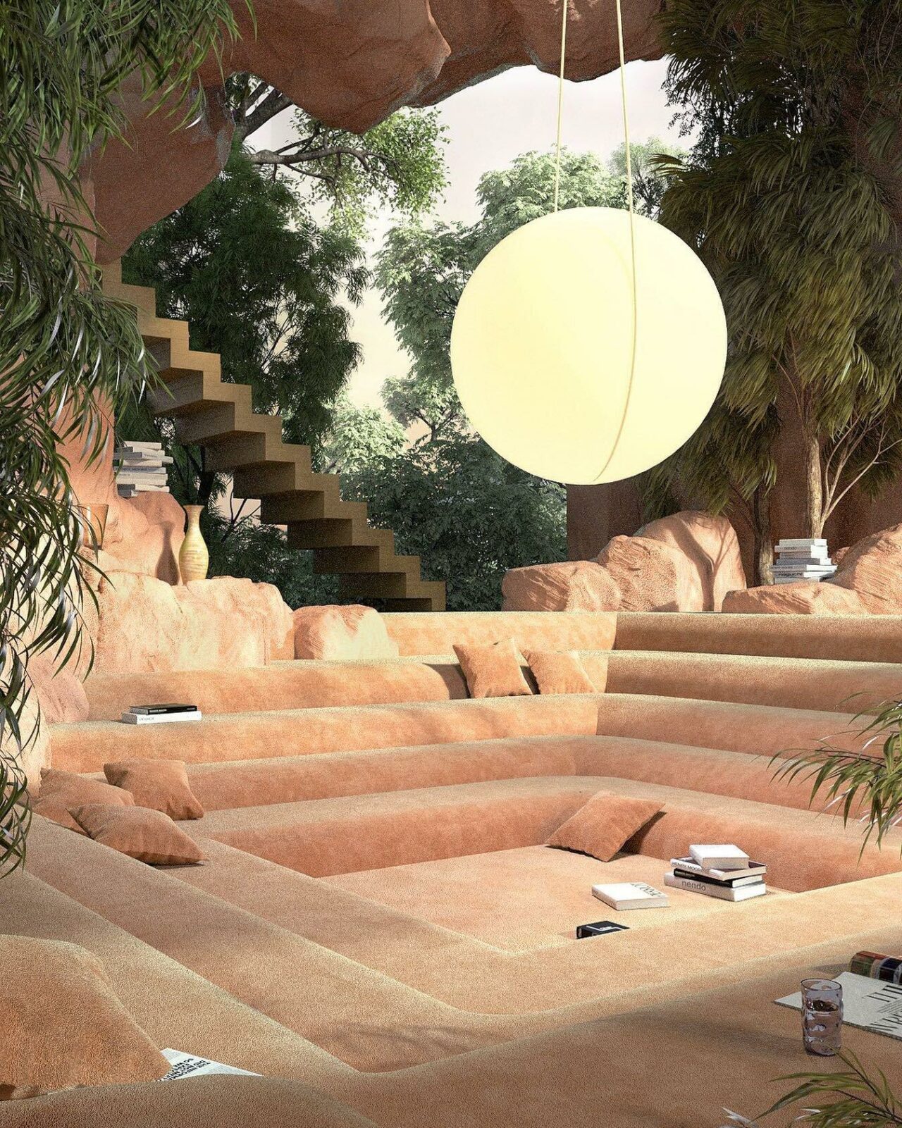
With the rise of digital tools enabling us to re-imagine space and the potential of design, it not uncommon to come across visual landscapes so vivid and perfectly composed, that they could be utterly plausible. Yet, realistically can only ever exist on our screens. With their perfect compositions and proportions, its as though we’re entering a whole new dimension of a future utopia, one that is thrilling and visually captivating — expanding minds and hopeful, not-so-distant realities.
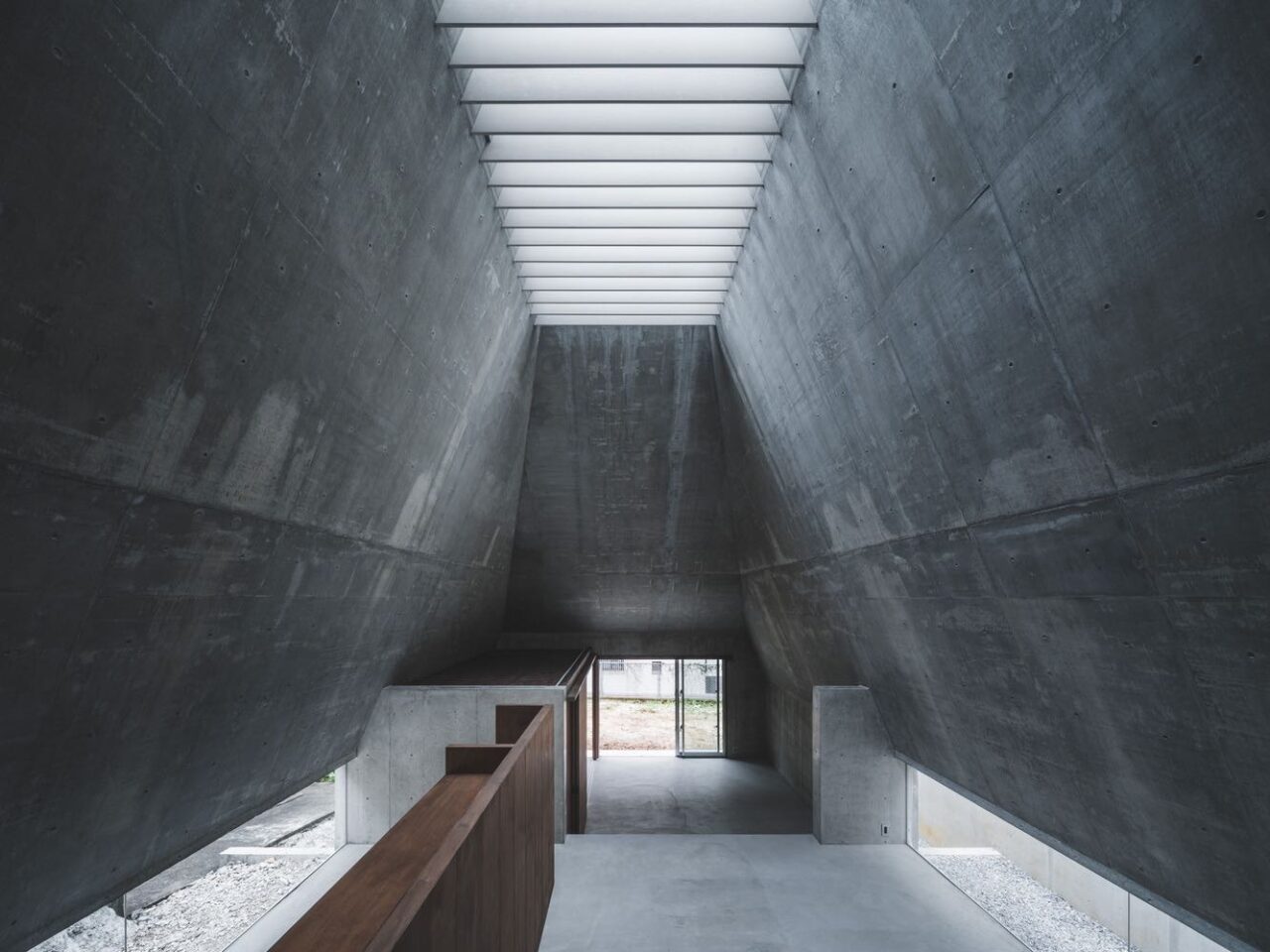
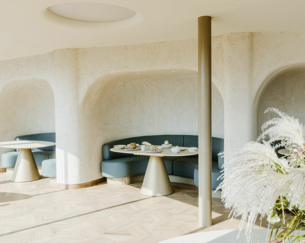
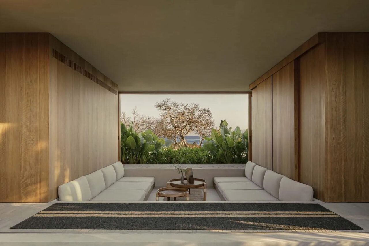
One talented visual creative whose works are undeniably transportive are that of London-based 3D designer Joe Mortell. With a unique eye that lends to a striking and contemporary aesthetic, his work is a mix of art direction, animation and illustration focussing on set design, fantastical landscapes and surreal scenes. Formerly a designer for The New York Times, to a mix of global clients including AllBirds, Verizon, Volkswagen, Louis Vuitton, Bosch. Most recently, Mortell’s mesmerising work has graced the cover of Wallpaper* magazine, the result of a visual collaboration with interior stylist Charlotte Taylor. With an interest in fiction and the immersive realm of films and books, he also counts the American architect John Lautner as a large influence on the architectural structures featured in his works.
We speak with Mortell on the fundamentals of creating a great image, to his thoughts on the future of the digital landscape.
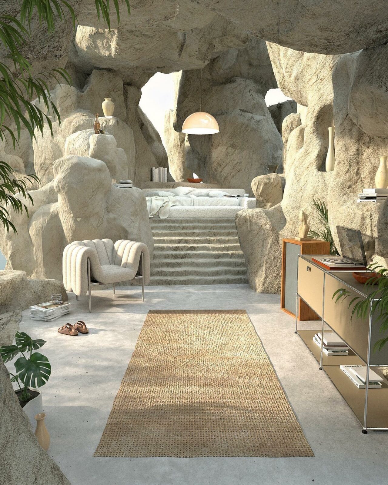
Please tell us about your earliest memory or inspiration that led you to the digital landscape:
I’ve been a huge fan of Nintendo my whole life and started playing Super Mario at the young age of 3! I loved everything about it. Especially the idea that you had access to these whole worlds in the game. There are so many imaginative and dreamlike ideas packed into Nintendo games, they still continue to be a great source of inspiration for me.
What is your process when creating an image from scratch?
I usually start by having a loose idea in my head of what I want to make. I’ll then start to collect reference images based on the type of setting it will be in. I mostly use Pinterest for this as I find it really useful to have different boards dedicated to forests, deserts, pools, furniture and so on. I usually skip the sketch stage and just start working straight in Cinema 4D. For me, I find that it’s easier to work in 3D straight away so I can experiment really quickly by moving objects around and playing with the camera to get the right angle.
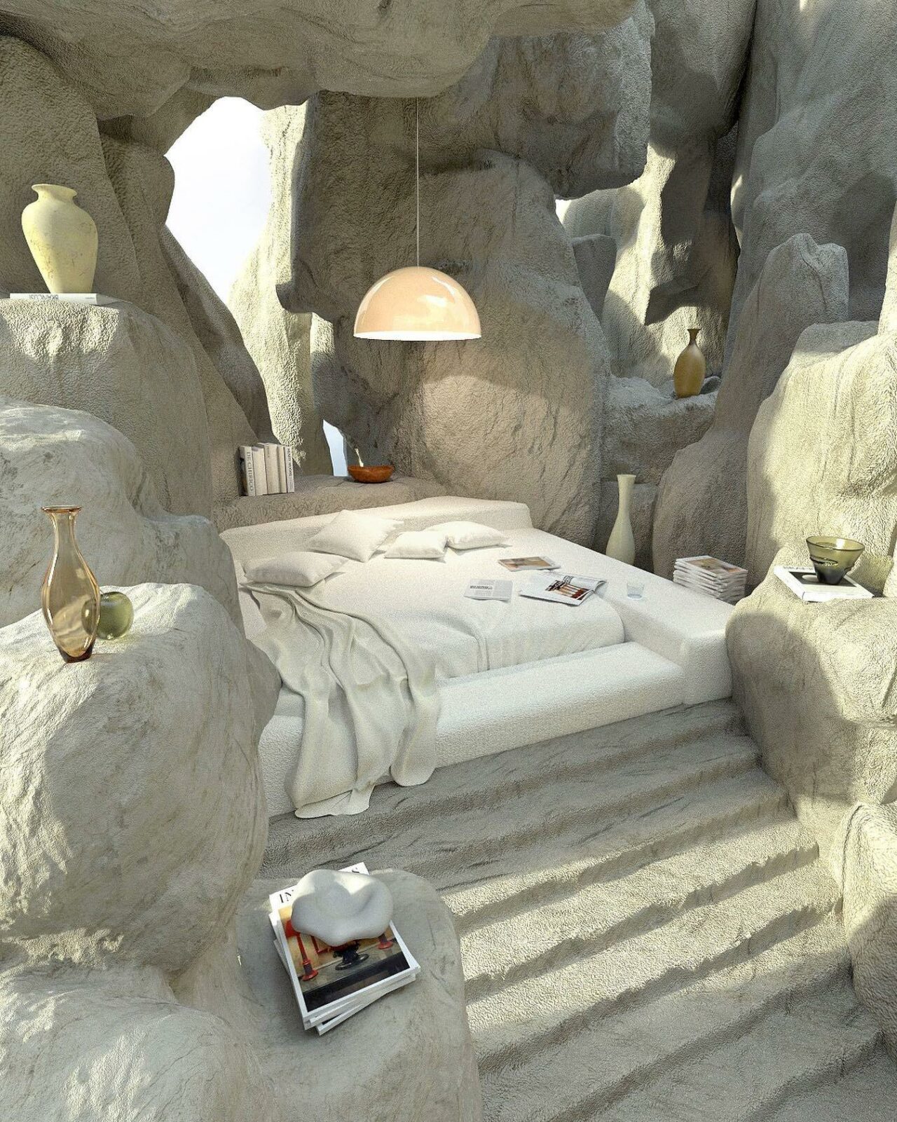
How do you find the balance of creating enough in an image?
This is something that I found comes down to the smaller details. When you first start making a scene in 3D it can sometimes feel like it doesn’t have enough visual interest in it. But spending time and adding the smaller refined details will almost always solve this!
In my earlier work I used to spend time re-adjusting the composition and adding more elements and objects until it had the impact I wanted. But they ended up being quite chaotic and busy. I realised that if you focus on making the textures more realistic and add some finer details it will create the impact you want.
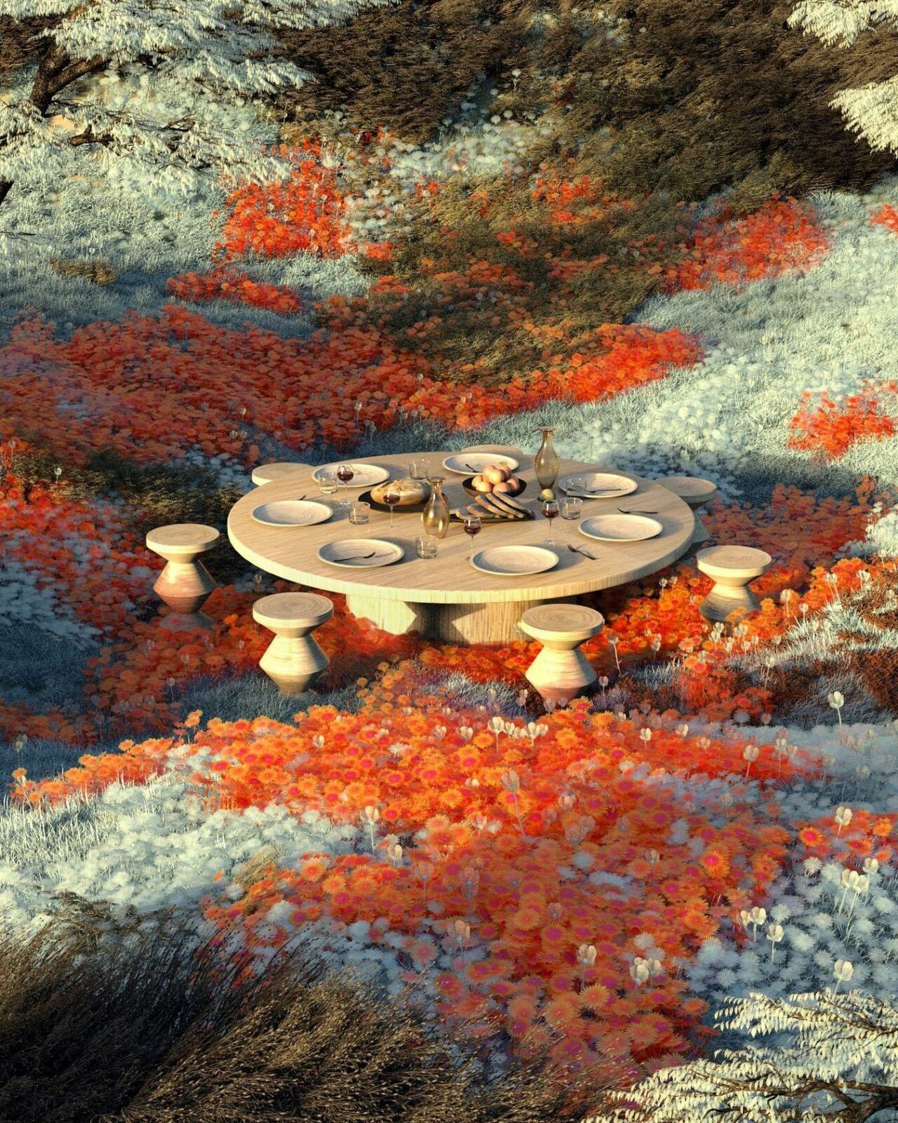
What are the fundamentals of a great image:
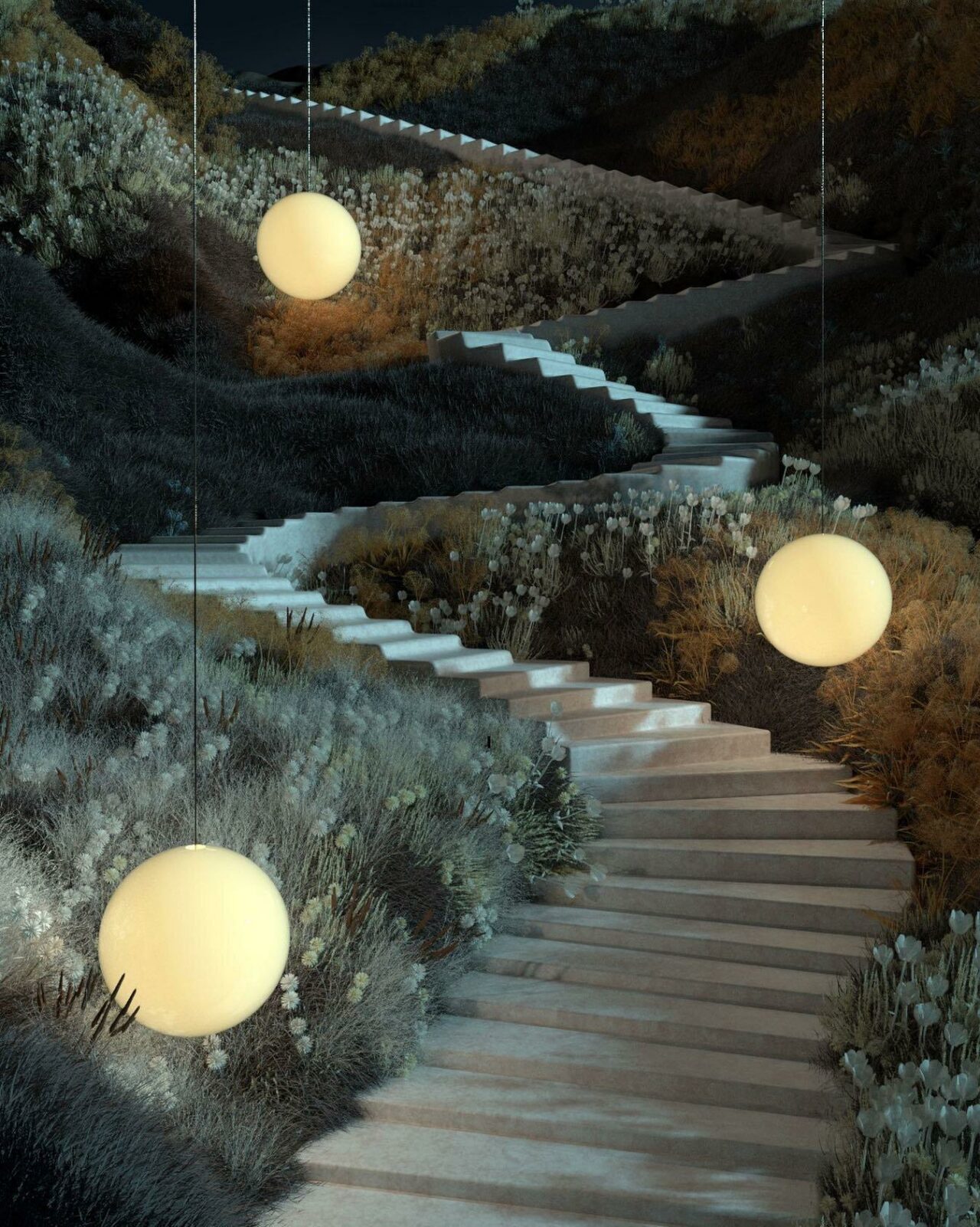
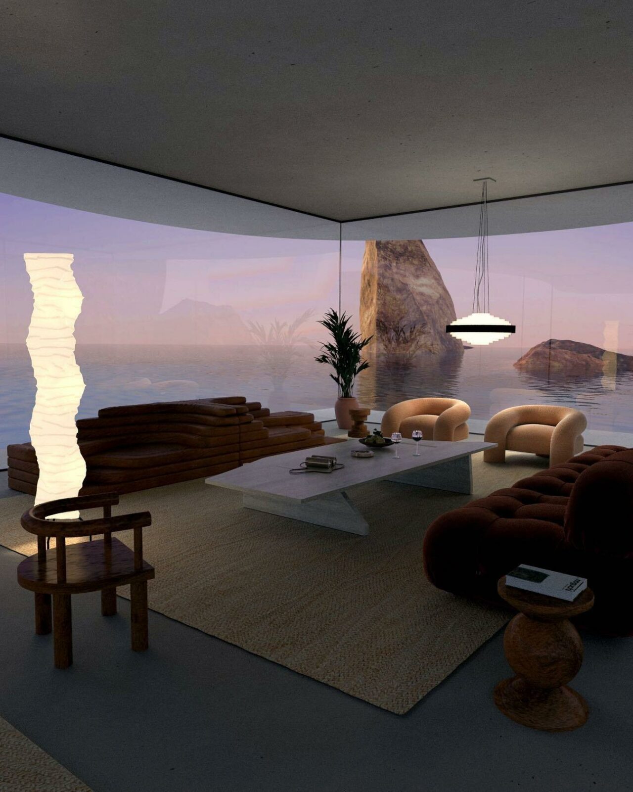
I believe that finding a good balance between reality and the surreal is one of the key elements. It should feel exciting, unusual and imaginative but also be a place that might just be able to exist. It helps if the viewer could see themselves being able to enter into the scene. If there is a doorway, steps or a place to sit or lie down. Showing that the scene is not confined also allows you to imagine yourself being able to walk into other areas that are out of sight and imagine it being a part of a larger world.
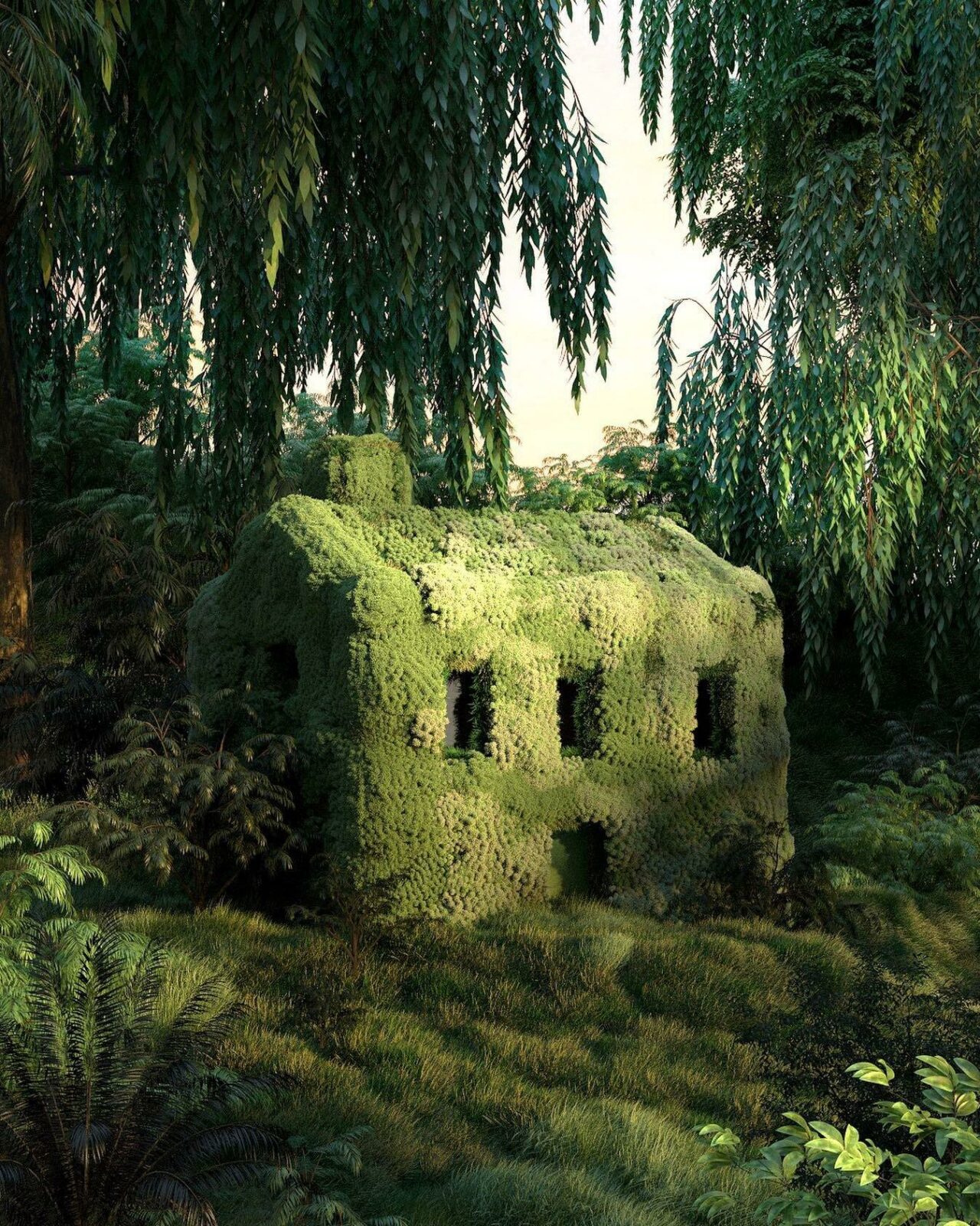
What have been some of your favourite projects to work on?
One of the great things about working in 3D is the variety of projects you get to work on. I always enjoy getting a brief with a slightly unusual side to it or something that I haven’t tried before. However, I also like projects where you get to spend time modelling and adding those fine details which can be very satisfying.
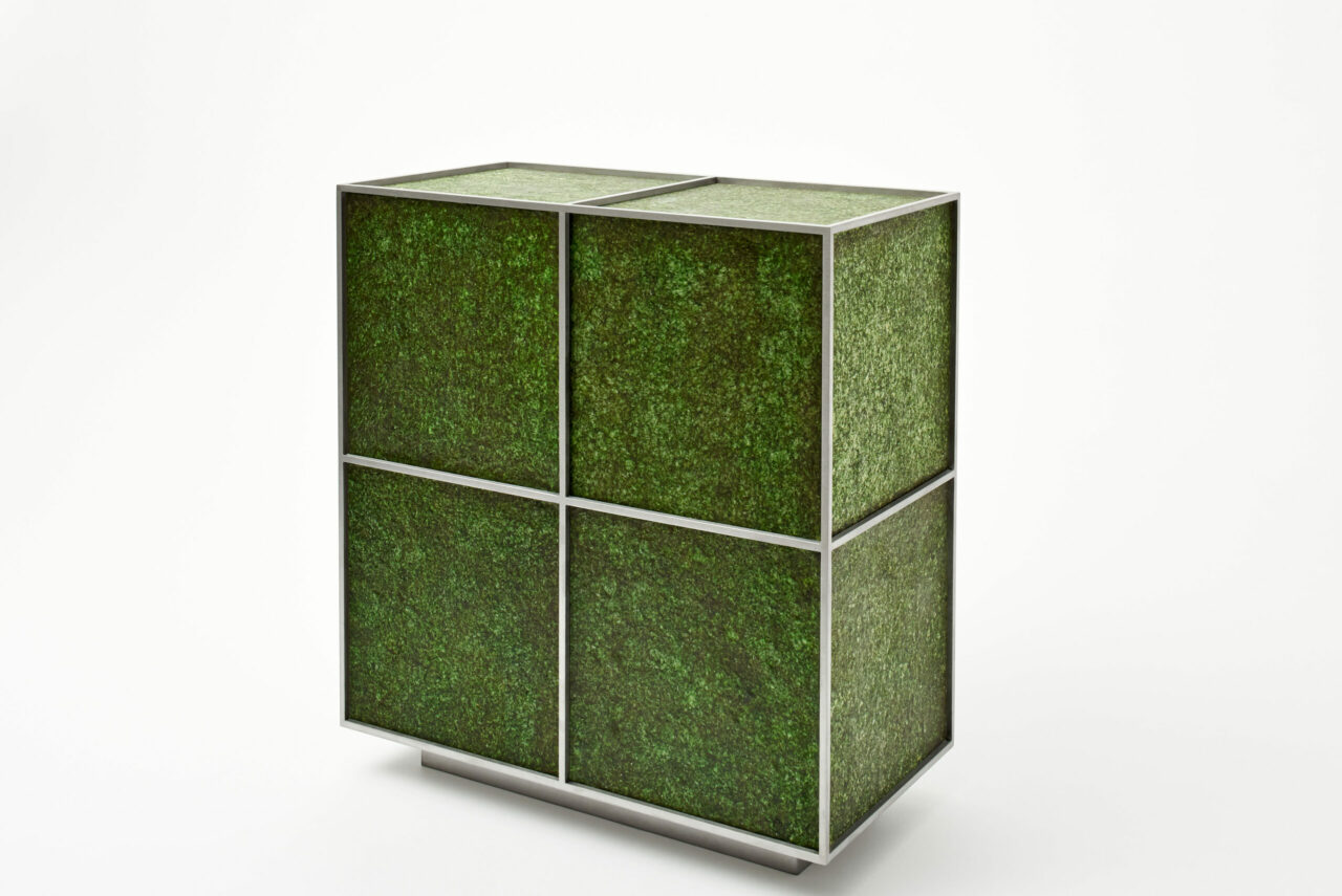
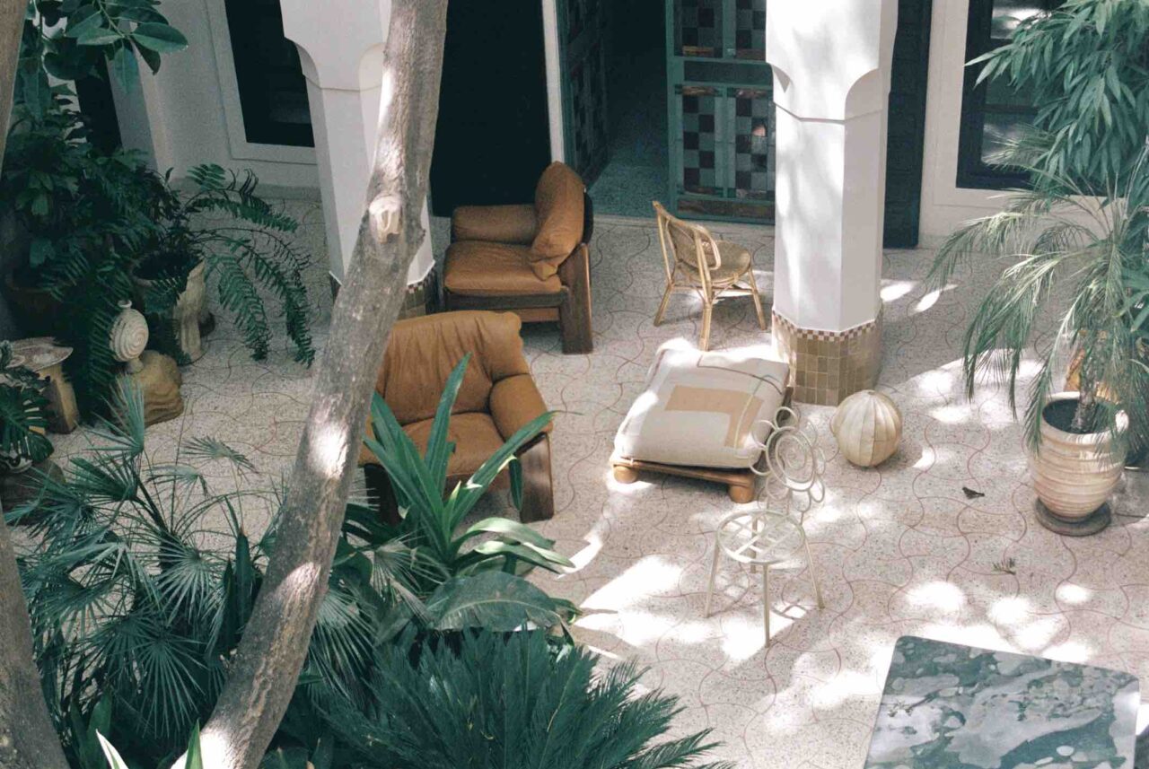
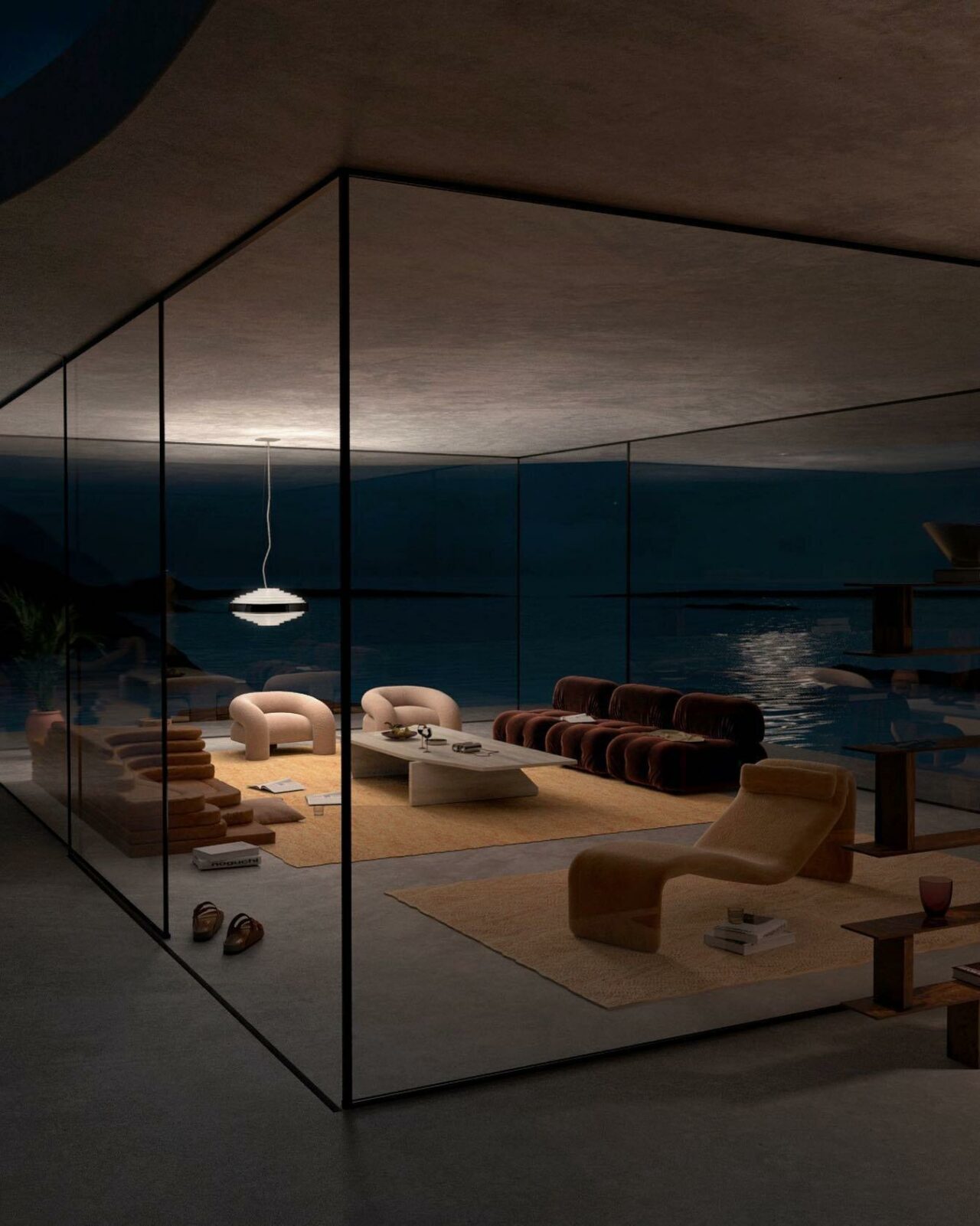
A few projects that come to mind are modelling and animating birds for AllBirds shoes and NYT that was great fun to work on. I also recently worked on a project for Wallpaper* with Charlotte Taylor where we mixed furniture with outdoor spaces. Another would be creating six unique surreal animations for Youth to the People.
What is better: reality or fiction?
I will always prefer fiction. Along with growing up playing Nintendo, I’m a huge movie fan and am always on the lookout for new books. During last year I’ve been reading a lot of Japanese author Haruki Murakami’s books as he has this really nice writing style that I find relaxing to read. I loved 1Q84 as it has this vast world and storyline that I really enjoyed.
Are there any other artists that inspire you?
Yes absolutely! So many. Leif Podhajsky’s archive Visual Melt is a constant inspiration to me. It’s a great collection of surreal artists’ work. Carl Burton’s work was an early inspiration into 3D with his amazing and subtle GIF’s. The architect John Lautner has had a big influence on my architectural structures too. I’m also in constant admiration of the work of Hugo & Marie, Sebastian Cestaro, Max Guther, Stefano Giacomello, Robin Barnes, Alexis Christodoulou, Charlotte Taylor, Oscar Piccolo, Peter Tarka, Carlos Neda, Fausto Mauriz, Boldtron, Nathan Riley, ni.acki, James Tralie, Riccardo Fornoni, Hannes Lippert, Hugo Fournier, Jesús Mascaraque and Man Vs. Machine to name a few!
What do you envision or anticipate the future digital landscape will look like?
There’s a great thing happening right now where it’s really starting to become quicker and easier to create 3D work. I think this will have the effect of people being able to create more immersive pieces of work. Something that I’ve always been interested in is to create longer animations where you can start to move around the spaces.
Interview: Joanna Kawecki
Images: Courtesy Joe Mortell


