AESOP SHINSAIBASHI
Simplicity Creates An Interior Of Material Contrasts Inspired By The Site's Heritage
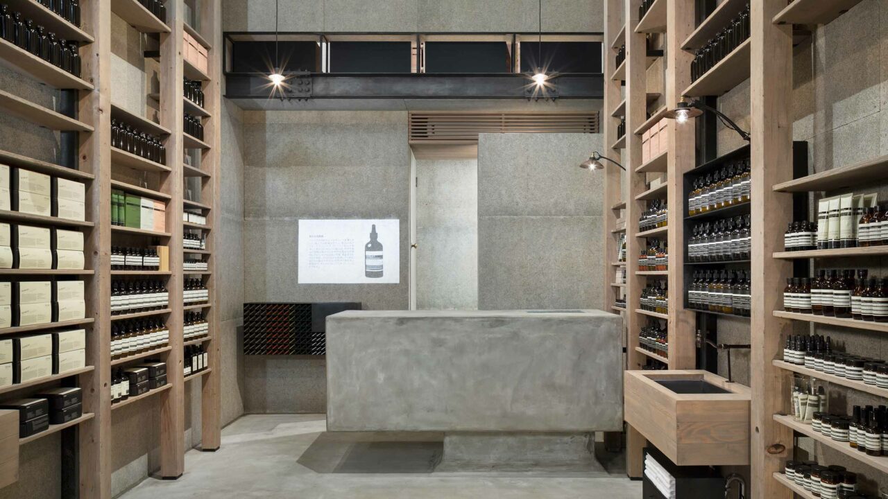
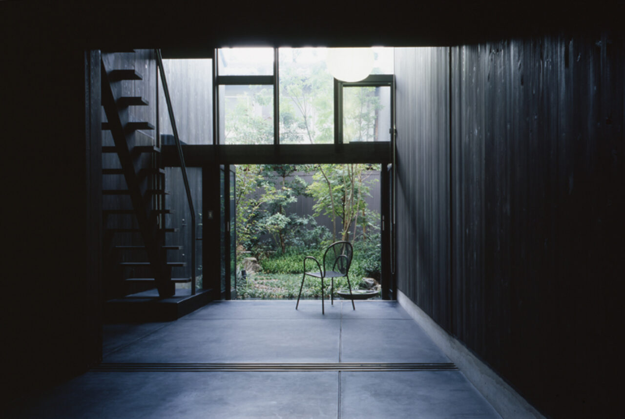
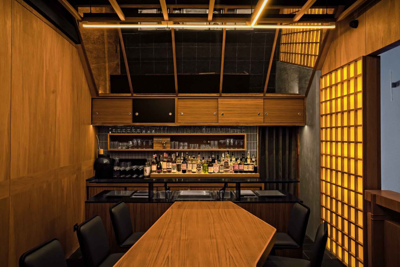
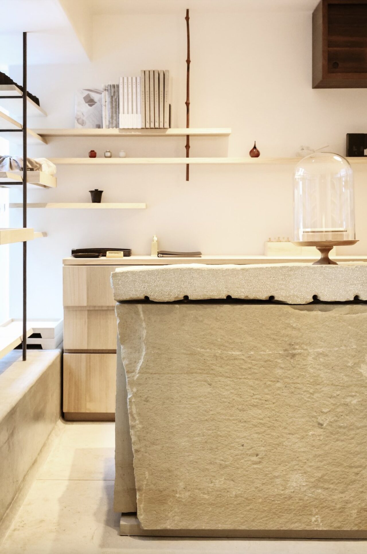
As Aesop’s first signature store in Osaka, AESOP SHINSAIBASHI is a delightful ode to the minimalistic sophistication of Aesop with an interior that references the site’s heritage. Designed by Tokyo-based design firm SIMPLICITY led by Shinichiro Ogata, the interior features grey, concrete flooring extending to a large concrete counter as retail desk by the rear of the store with weathered timber shelving reaching high ceiling heights. Situated in Osaka’s vibrant Shinsaibashi district, the store’s design embodies a refined industrial aesthetic that pays homage to a time when the neighbourhood streets were lined with storehouses surrounding an important timber yard. Details of blackened steel are also found amongst shelving that reference the industrial heritage, specifically “chosen for its local historical significance, this material references the iron bridge that once tethered the north and south districts of Chūō-ku ward.”
AESOP SHINSAIBASHI
1-6-34 NishiShinsaibashi, Chuo-ku
Osaka, 542-0086
For more design and travel destinations in Tokyo and Japan, click here.
#champ_japan
Text: Joanna Kawecki
Images: AESOP


