NO FEAR OF GLASS
Sabine Marcelis Presents New Perspectives in Mies' Barcelona Pavilion
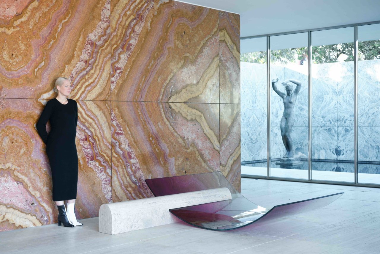
Designer Sabine Marcelis presents ‘No Fear of Glass’ at the Mies van der Rohe Barcelona Pavilion, an intervention of exhibited works re-interpreting the pavilion’s materials to encourage new dialogues within the space.
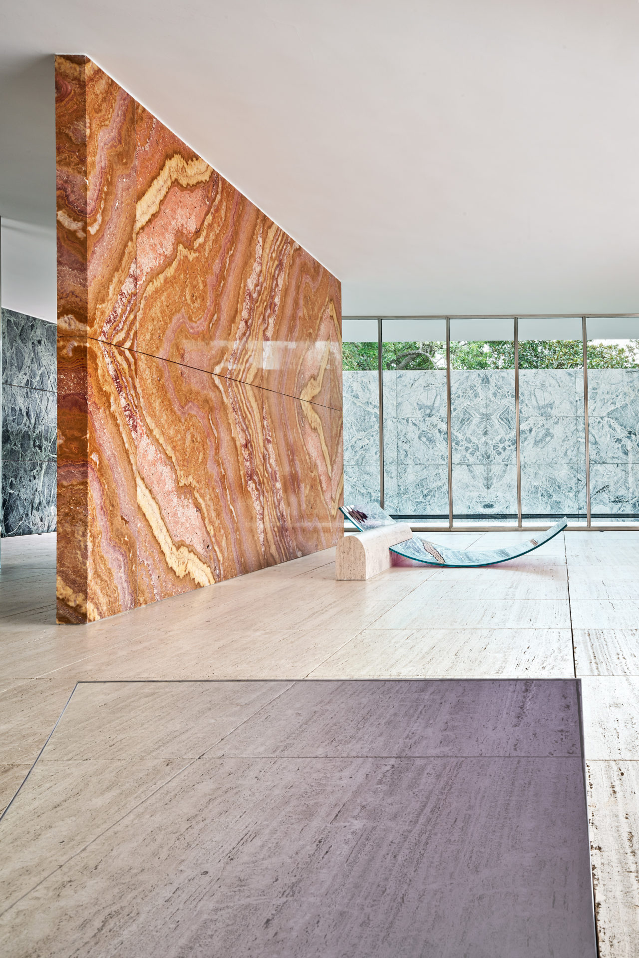
Designed by Ludwig Mies van der Rohe and Lilly Reich as the German Pavilion for the 1929 Barcelona International Exhibition, the duo worked with glass, steel and varying types of marble stone. Sabine has celebrated the existing materials but created new perspectives on their overall presence in the space. Through challenging Mies’ quote to “not use too much glass” in the Pavilion design, Sabine specifically utilised the material to present new possibilities for its form in the Pavilion and interactions surrounding it. “It is both an honour but also a very tricky task to create an installation in such an iconic structure“, the designer states, “The pavilion is so pure and final, any additions need to be thoroughly thought through, and extremely well considered. I did not want to be too aggressive, and at the same time I also did not want to use the pavilion merely as a site or surrounding. The works needed to blend in and be born from the pavilion. I wanted to build upon his heritage, and to create a temporary meeting of two worlds; his and mine“.
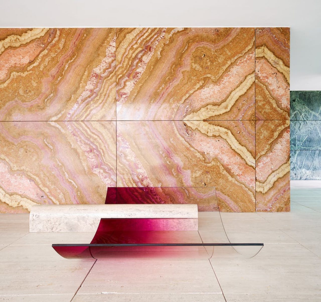
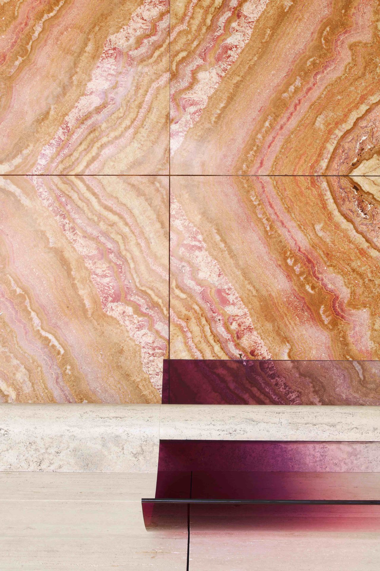
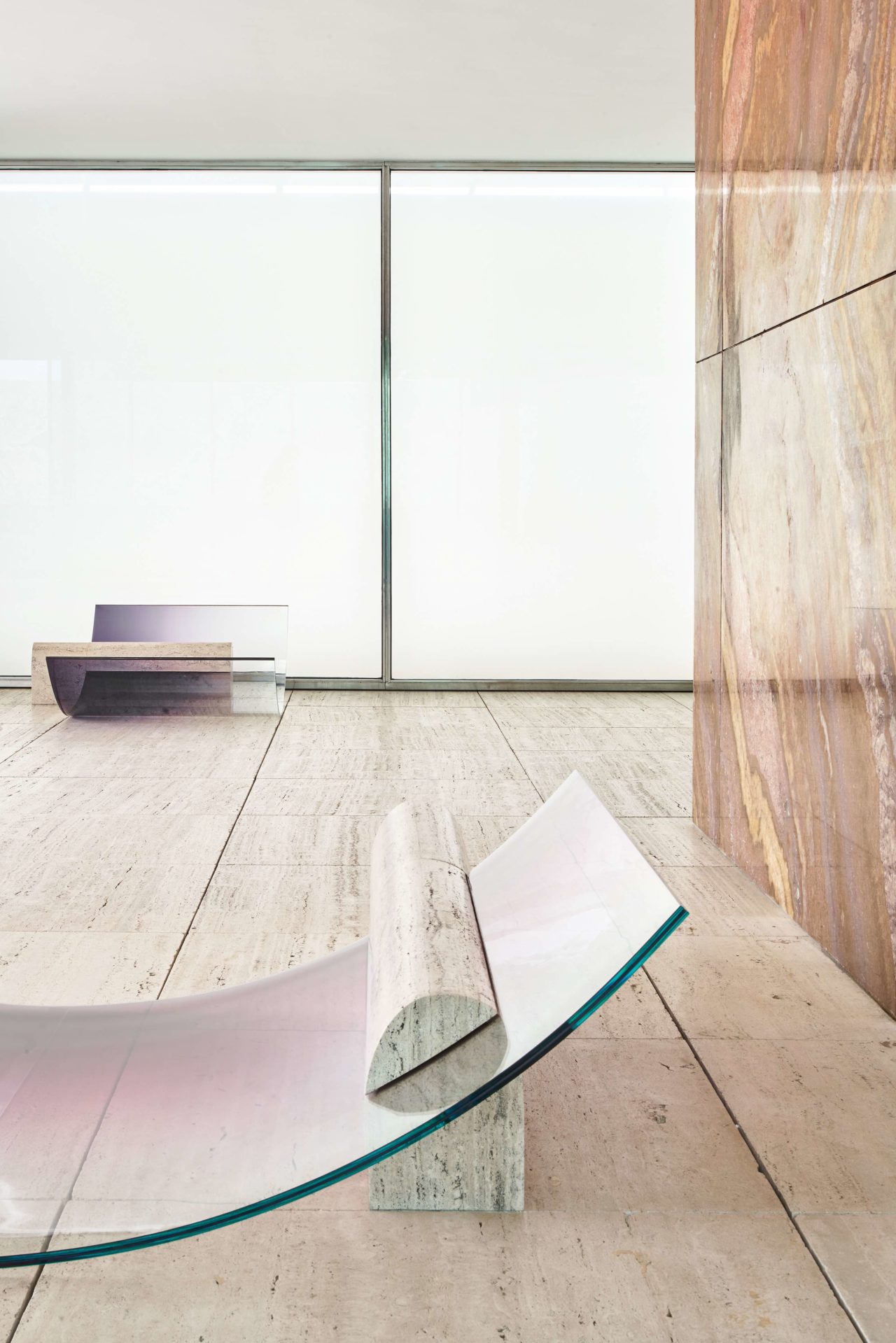
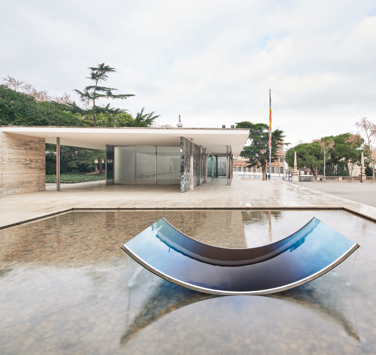
Creating five new works for the show, two chaise longues, a fountain and two pillar lights, Sabine has successfully proved that modernist ideals are ever-relevent in design and architecture. She explains “As a designer, I wanted to explore the idea of creating functional furniture and objects which have their origins rooted in the design ideology of the pavilion. How can the purity of this building inform other designs in the realm of functional objects. Build with the same materials and growing from the architectural planes“.
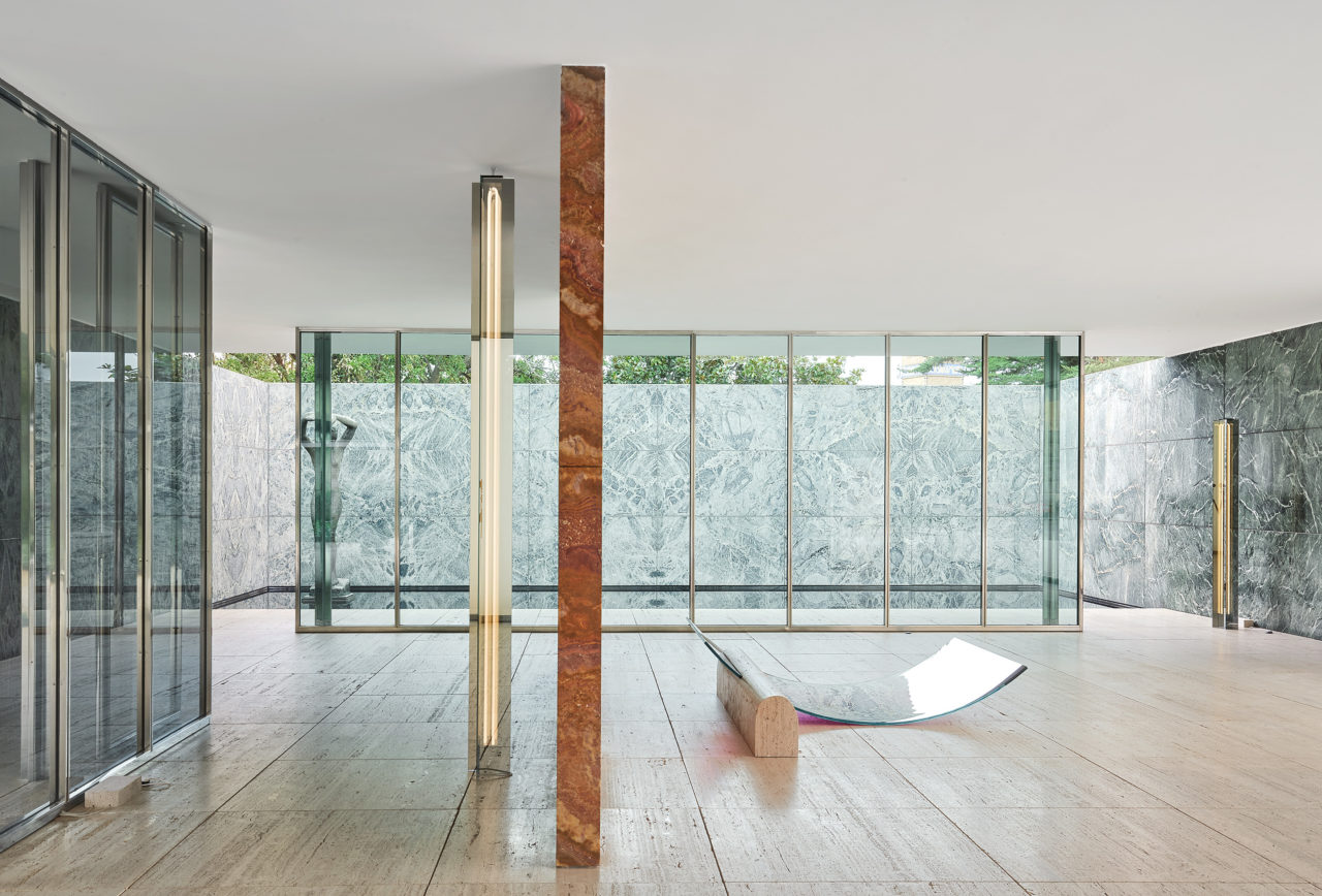
Seamlessly introducing the new works into the environment upon which they are informed, Sabine further explains her process, “Of course with the addition of these functional pieces the architectural experience is altered, but the main aim was to use the architecture as a starting point to design objects from. Objects which become stand-alone eye-catching contemporary designs, but at the same time they shouldn’t look out of place. They should feel like they have always lived in this setting and are really extrusions and extensions of the architecture.”
OMA/AMO partner Ippolito Pestellini, also a contributor to the corresponding book to the show, reiterates this, “She [Marcelis] has looked at the Barcelona Pavilion’s materials–glass, travertine, and chrome–with intelligence, to design a series of new pieces that seem to emerge from the architecture itself. No Fear of Glass is not just a solo show, it is a hymn to the infinite liberating possibilities that modernism still has to offer…” Indeed Sabine’s design also reflects the practicality of her design interaction, with one light column serving as the ‘ninth’ column in Mies’ eight-column structure. Ingenuity interlocked with the geometry of the pavilion.
Sabine’s exploration has presented new possibilities within the space, and with the notion also encouraging perspectives which may range further. Mies’ design is only the framework for multiple conversations made possible through his ideals, now recognised as universal. Artists and designers Ai Weiwei, Enric Miralles and Ryue Nishizawa have previously also taken on this challenge, but few have provided such a unique lens on the structure’s architectural planes and materials in unity with one another, extended through new proposals for functional objects.
We speak to Sabine about how she took on the challenge of designing in the Barcelona Pavilion, successfully elevating design ideals conceived almost a century ago.
With your motivation ‘No Fear of Glass’ in contrast to Mies Van Der Rohe’s intention to use as little glass as possible in the Pavilion, in what ways did you push this material to its extreme?
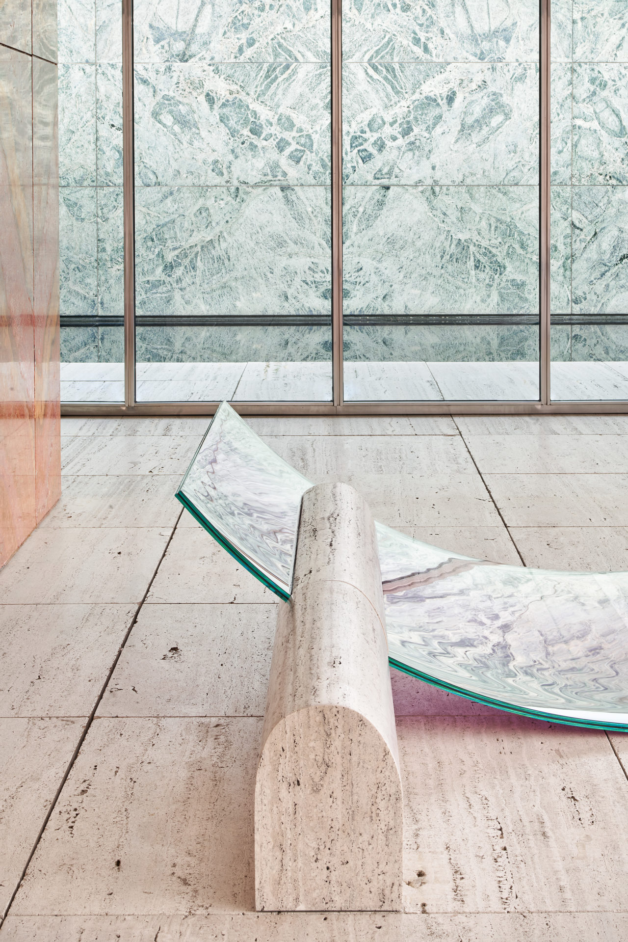
Scale, physics. everything has been produced at extremes in this project. The curvature ratios of the glass sheets are ergonomic but also the largest possible to fit in existing glass laminating ovens. The size of the glass neons in the lighting columns were also the largest possible to produce. I may have annoyed quite some people within the process of having these works produced., constantly asking them to create at the limits of what is possible.
Did you discover any new qualities to the material you had not known about before?
Mainly within the fountain there were some surprises. As is always the case when working with water; you think you know what it is going to do, but then its still does something else and you have to tame it in a different way…
Where were the works made?
All Dutch companies actually! With the exception of one German company who had the largest glass-bending oven, so we worked with them for the glass-bending.
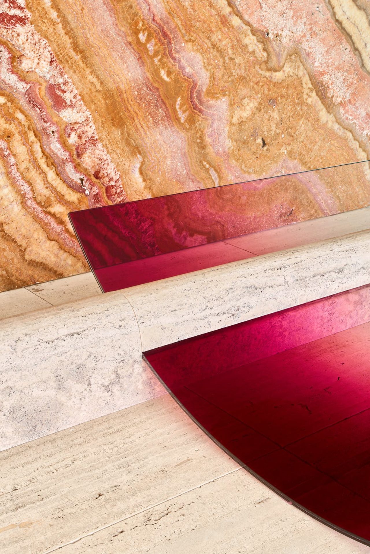
The travertine was made by Solid Nature in Amsterdam. They did an excellent job at matching it exactly to the pavilion flooring so it really felt like it was the same stone extruded from the floor. After machining the travertine initially it looked way too clean and perfect. They then rubbed a lot of black soot all over it to age it just like the pavilion flooring. The glass work was with a few different companies that all specialise in different aspects of the production process.
Did you come across any challenges throughout the entire process?
Absolutely! Endless issues and unexpected results and problems when working on such a large scale…But nothing that couldn’t be brainstormed through to find solutions for. This is really my favourite part of the design process. To keep pushing and annalysing what to do different together with factories to get to the desired result in the end.
The fountain was the biggest challenge in my whole design career so far. I always feel that if the production side of a design doesnt have significant challenges, its not going to be an interesting project for me. The element of pushing boundaries within materiality and production capabilities is so vital to my design approach.
Would you accept a similar challenge in the future again?
I hope to create similar works in the future in other inspirational locations. To create from a blank canvas has always been difficult for me as then there are just way too many options. I love to restrict myself and set a brief with a strong concept and really stick to it firmly so that all design decisions can be defended and backed up, there is a reasoning behind every aspect of the work.
Where will the works reside after the end of the exhibition?
They are all for sale in a very limited edition, so some have already found new homes. The installation will also be presented again at Design Miami Basel in June.
∆
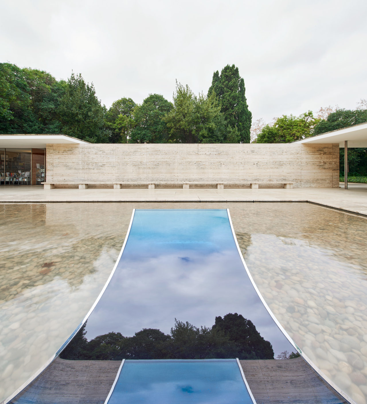
No Fear of Glass at the Barcelona Pavilion
Av. Francesc Ferrer i Guàrdia, 7, 08038 Barcelona, Spain
Please note: the exhibition has now closed, but the Mies Van Der Rohe Barcelona Pavilion remains open
#Champ_Barcelona
Photographs Jose Hevia | Words Monique Kawecki


