Serpentine Pavilions 2000-2021
A Champ Online Retrospective Of Two Decades of The Radical Architectural Event
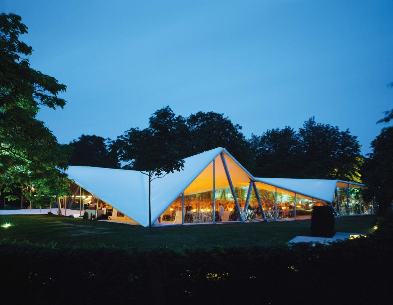
What began as an unassuming temporary marquee structure commission led to becoming one of the world’s most anticipated architectural events of the year. Erected each year in the month of June and situated in London’s Hyde Park positioned in front of the commissioning Serpentine Gallery, the Serpentine Pavilion is undoubtedly the world’s most innovative design highlights of the year. The Serpentine Gallery’s Pavilion concept was initially inadvertently created in celebration of the gallery’s thirtieth anniversary in 2000, where Iraqi-British architect Zaha Hadid was invited to create a tent structure with the ability to house 400 seated guests for the gallery’s celebratory event held now over twenty years ago.
Zaha Hadid’s inaugural pavilion in 2000 was designed as a 600sqm steel structure informed by its triangular roof housing diverse internal spaces. With Hadid’s radical interpretation of the traditional shelter structure, so began the unprecedented Serpentine Pavilion concept that would continue annually every June, each year with a different globally-leading architect invited to create a new pavilion — experimental propositions in size, material, concept and budget — and given full freedom almost wholly with an open brief. More-so, the immediacy of the commission – a maximum of six months from invitation to completion – provided a unique conceptual structure.
From Japanese architect Sou Fujimoto’s transparent and latticed form utilising nature in 2013 to Swiss architect Peter Zumthor’s meditative outside-in garden pavilion, each structure was an example of innovative design, showcasing conceptual depth and often sustainable materials and construction. Furthermore, what makes the summer pavilions so radical is that it almost always secures a permanent home after its period in Hyde Park. From the grounds of private collectors’ homes to public museums, the longevity of the structures continues long after their erection in Kensington Garden, and furthermore assures their financing in creation and development. Find selgascano’s 2015 pavilion now permanently positioned in Los Angeles’ La Brea Tar Pits, to Bjarke Ingel’s 2016 “unzipped wall” purchased by Canadian developer Westbank — also the pavilions original sponsor — concluding with its final resting ground positioned adjacent to the company headquarters in Vancouver.
This year, the 2022 Serpentine Pavilion sees American artist Theaster Gates (with the architectural support of Adjaye Associates) create a conical, meditative space inspired by the architectural topologies of chapels and the great kilns of Stoke-on-Trent in the UK. Set to unveil on June 10th, follow Champ in our upcoming coverage on site in London on June 7th. For now, read on as Champ Editor in Chief Joanna Kawecki reflects back on 21 years of the Serpentine Pavilion.
2021
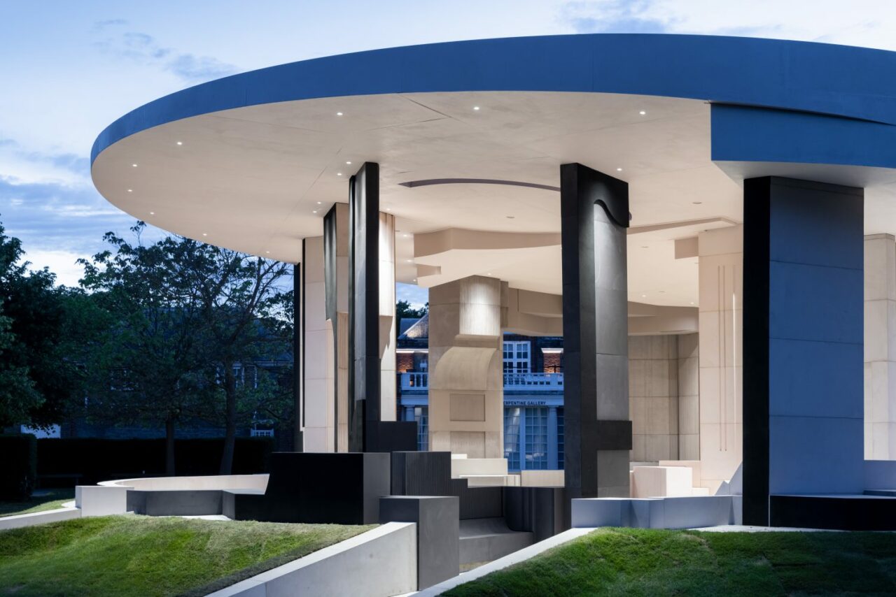
Sumayya Vally, Counterspace
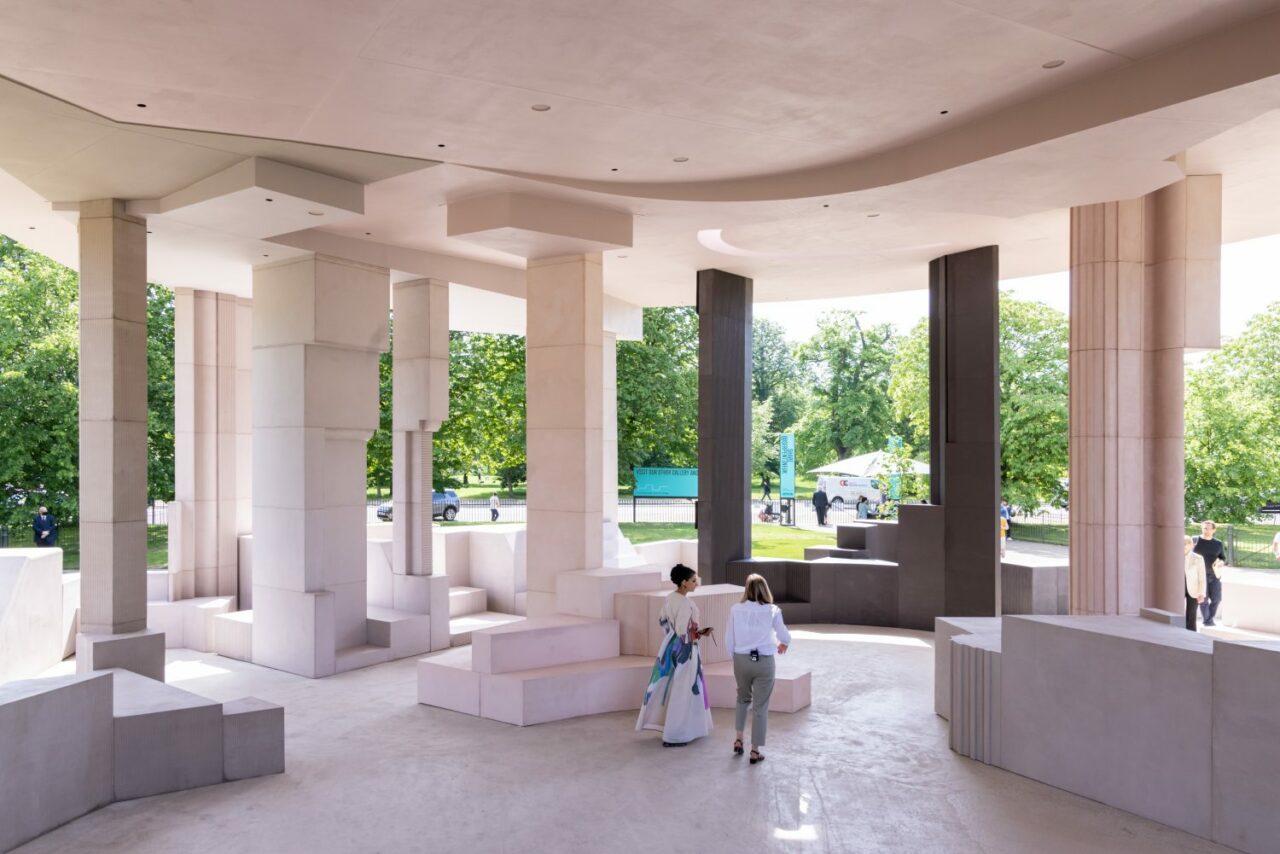
After a year of absence due to the Coronavirus, the 2021 Serpentine Pavilion was designed by architect Sumayya Vally, founder of Johannesburg studio Counterspace, who based her pavilion design on the importance of local community and its spaces offering a sense of belonging — taking inspiration from past and present places of meeting across several London neighbourhoods significant to diasporic and cross-cultural communities including Brixton, Hoxton to Tower Hamlets and Edgware Road to name a few. Responding to the historical erasure and scarcity of informal community spaces across the city, Vally’s Pavilion referenced and payed homage to existing and erased places that heavily impacted local communities. Among them, some of the first mosques built in the city, such as Fazl Mosque and East London Mosque, cooperative bookshops including Centerprise, Hackney; entertainment and cultural sites including The Four Aces Club on Dalston Lane, The Mangrove restaurant and the Notting Hill Carnival.
The Pavilion was built of reclaimed steel, cork and timber covered with micro-cement. The varying textures, hues of pink and brown were drawn directly from the architecture of London and reference changes in quality of light. The forms in the Pavilion were a result of abstracting, superimposing and splicing elements from architectures varying in scales of intimacy. Where these forms meet, they create a new place for gathering in the Pavilion. Vally noted, “My practice, and this Pavilion, is centred around amplifying and collaborating with multiple and diverse voices from many different histories; with an interest in themes of identity, community, belonging and gathering. The past year has drawn these themes sharply into focus and has allowed me the space to reflect on the incredible generosity of the communities that have been integral to this Pavilion.”
Material: Reclaimed steel, cork and timber covered with micro-cement.
2019
Junya Ishigami
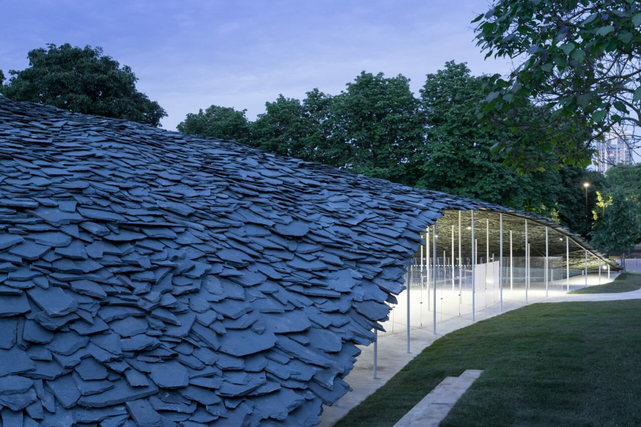
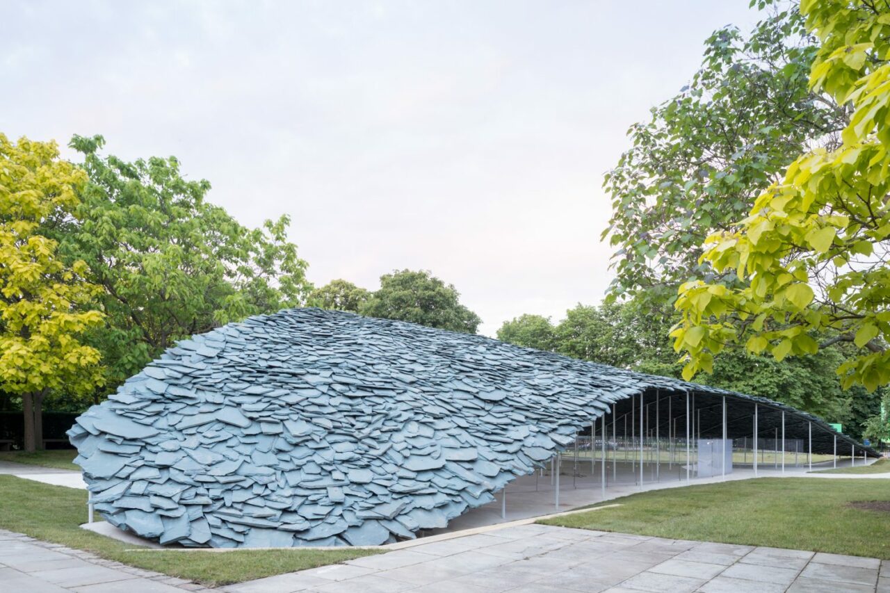
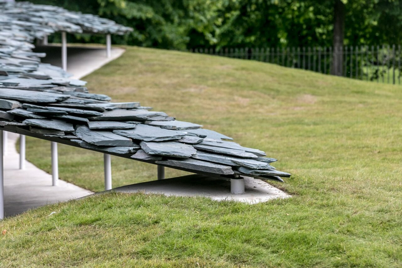
Japanese architect Junya Ishigami was appointed to create the 2019 summer pavilion, which took inspiration from roof tilings, formed by arranging 61 tonnes of British Cumbrian slate as a single sloping canopy roof that appeared to have emerged from the ground. Within, the interior of the Pavilion was an enclosed cave-like space, a refuge for contemplation. For Ishigami, the Pavilion articulated his architectural practice’s philosophy of ‘free space’ — creating an expansive, spatial experience — seeking harmony between man-made structures and those that already exist in nature.
Describing his form, Ishigami detailed: “My design for the Pavilion plays with our perspectives of the built environment against the backdrop of a natural landscape, emphasising a natural and organic feel as though it had grown out of the lawn, resembling a hill made out of rocks. This is an attempt to supplement traditional architecture with modern methodologies and concepts, to create in this place an expanse of scenery like never seen before. Possessing the weighty presence of slate roofs seen around the world, and simultaneously appearing so light it could blow away in the breeze, the cluster of scattered rock levitates, like a billowing piece of fabric.”
Material: Cumbrian slate
2018
Frida Escobedo
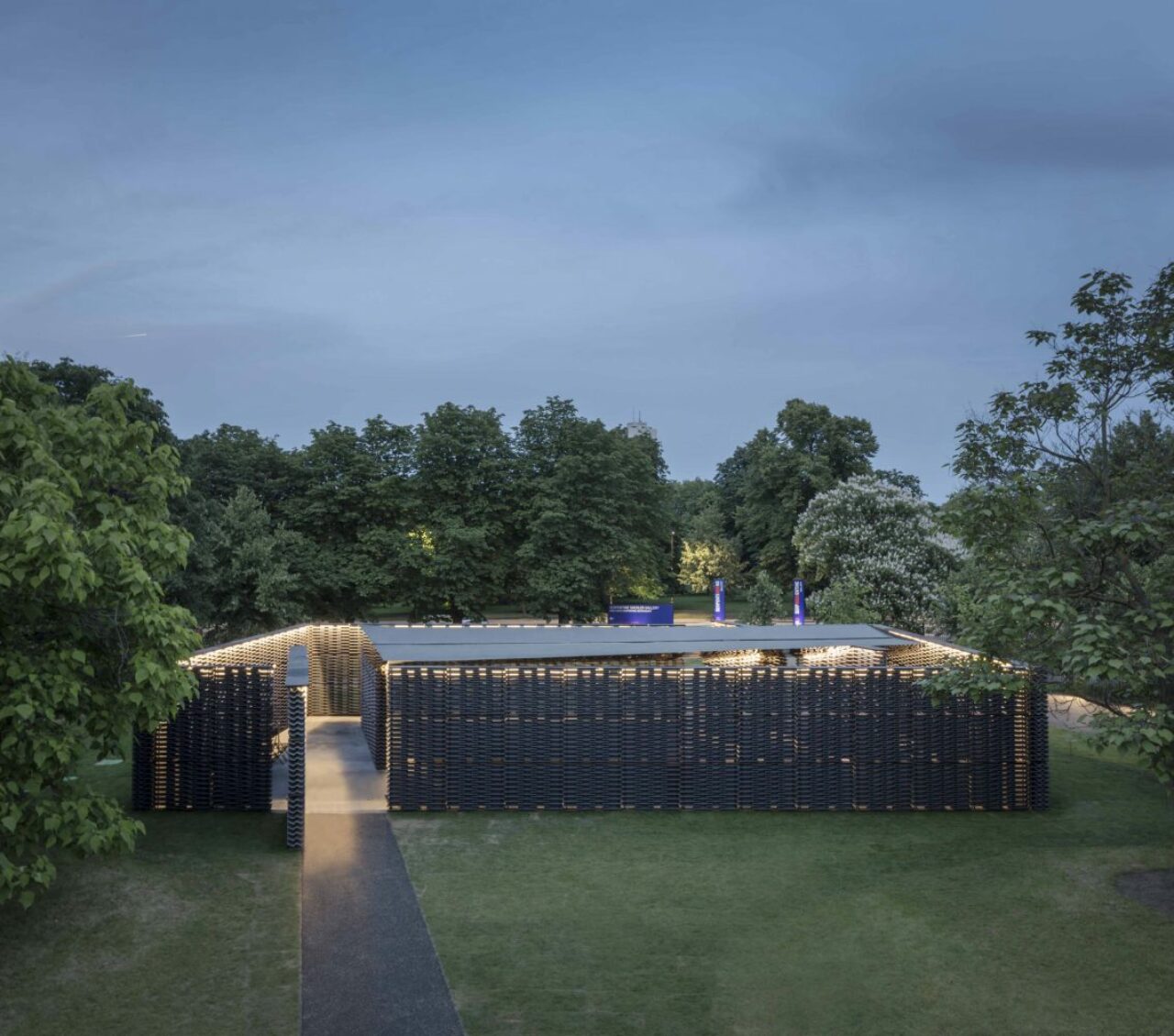
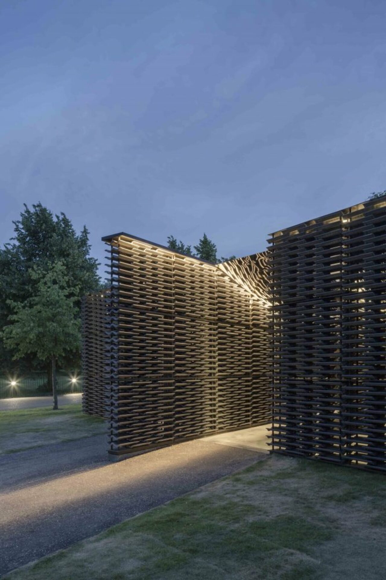
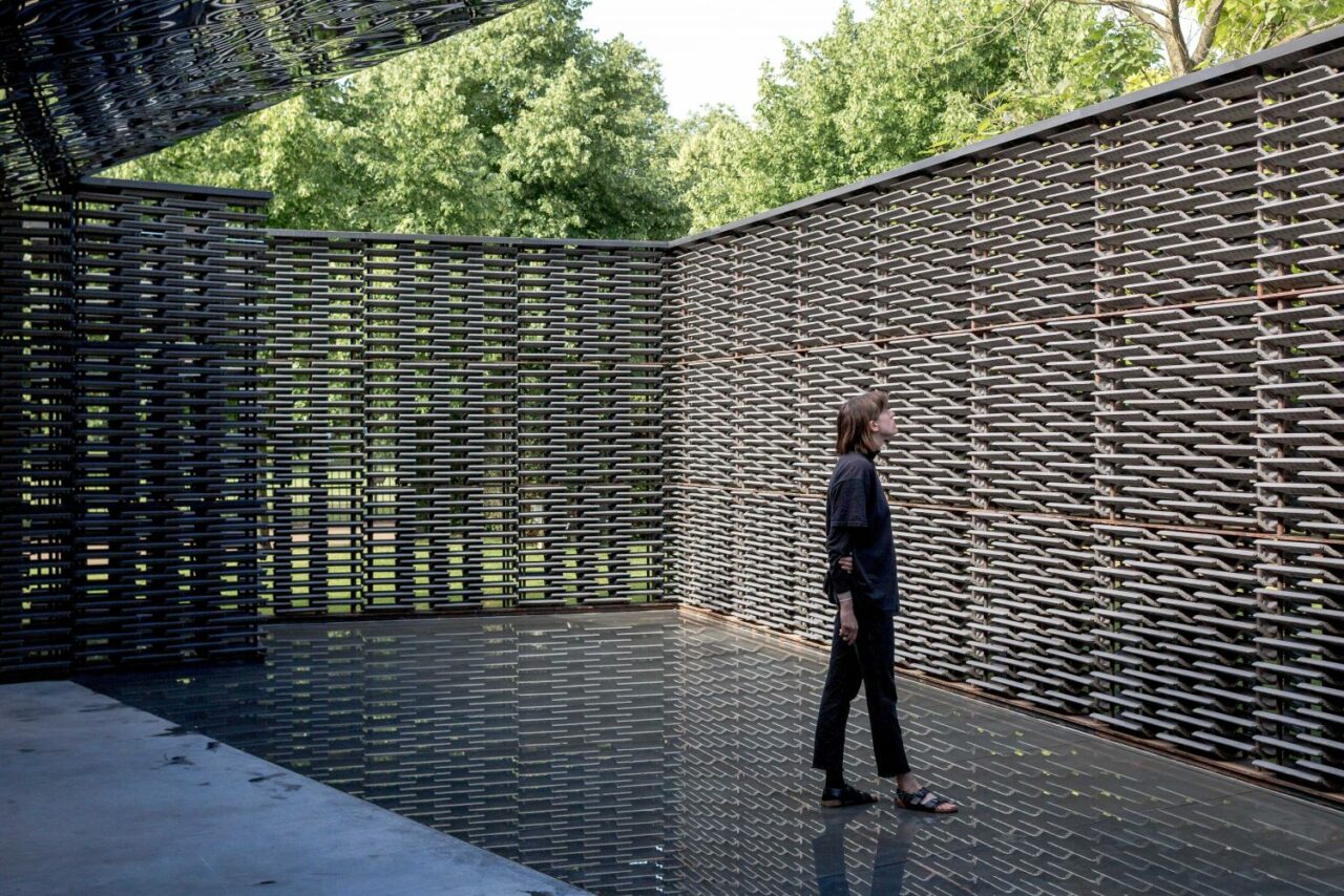
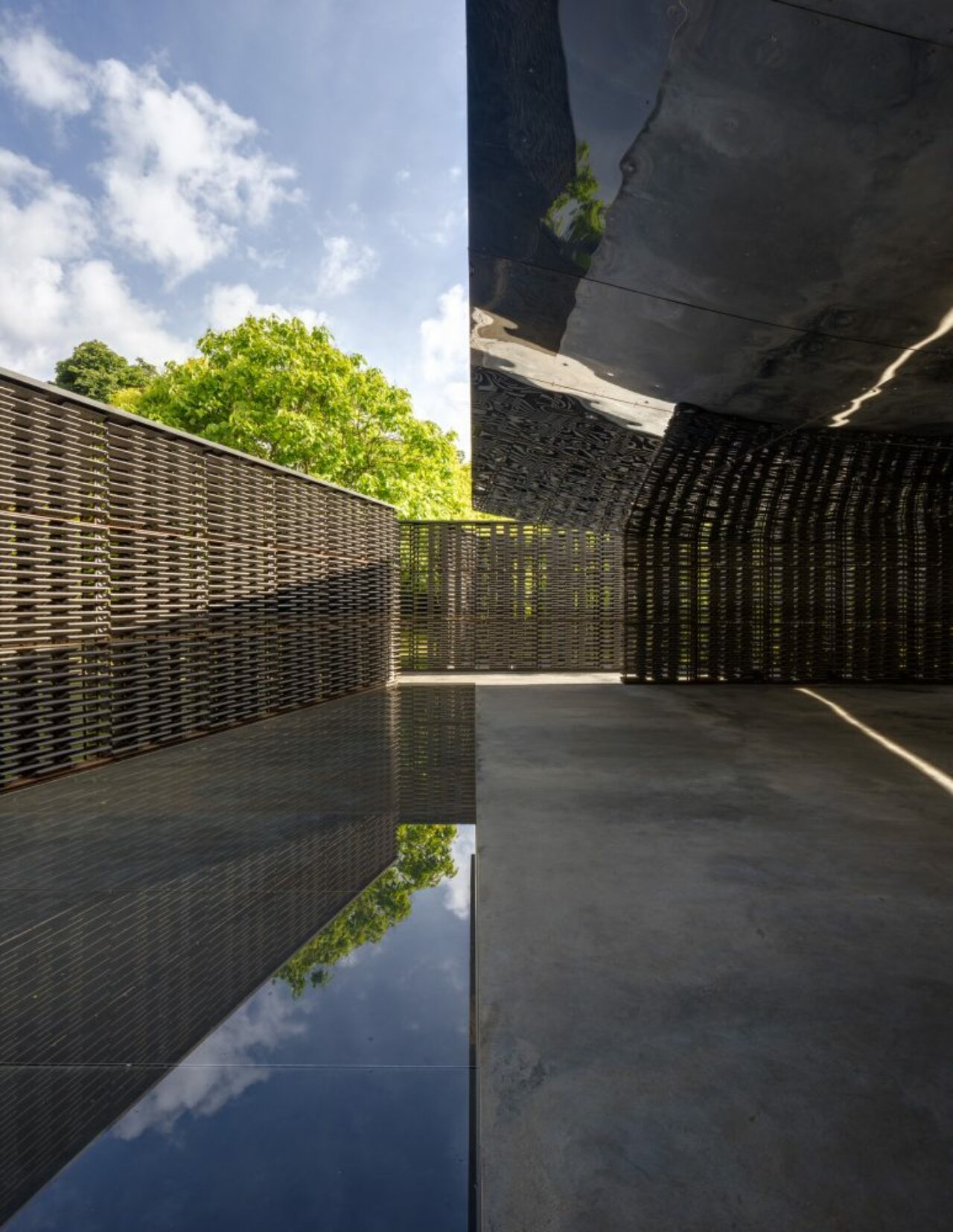
Harnessing a subtle interplay of light, water and geometry, Mexican architect Frida Escobedo‘s created an atmospheric courtyard composed of a lattice of cement roof tiles inspired by Mexican architecture yet utilising British-made materials.
As an enclosed courtyard comprised of two rectangular volumes positioned at an angle, the structure’s outer walls were aligned with the Serpentine Gallery’s eastern façade, whilst the axis of the internal courtyard aligned directly to the north. Escobedo took inspiration from the internal courtyards of Mexican domestic architecture – specifically a celosia, a traditional breeze wall – while the Pavilion’s pivoted axis referenced the Prime Meridian, which was established in 1851 at Greenwich and became the global standard marker of time and geographical distance.
Two reflecting elements emphasised the movement of light and shadow inside the Pavilion over the course of the day. The curved underside of the canopy was clad with mirrored panels, and a triangular pool cast into the Pavilion floor traced its boundary directly beneath the edge of the roof, along the north axis of the Meridian. As the sun moved across the sky, reflected and refracted by the internal pool of water or the cast shadows, a heightened awareness of time was created through play, improvisation and contemplation whilst inside the pavilion. Although subdued, the space was unassumingly minimalistic and impactful, utilising the natural phenomena of light and time.
Materials: British handmade tiles, water, mirror
2017
Francis Kéré
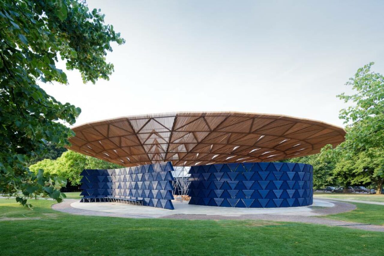
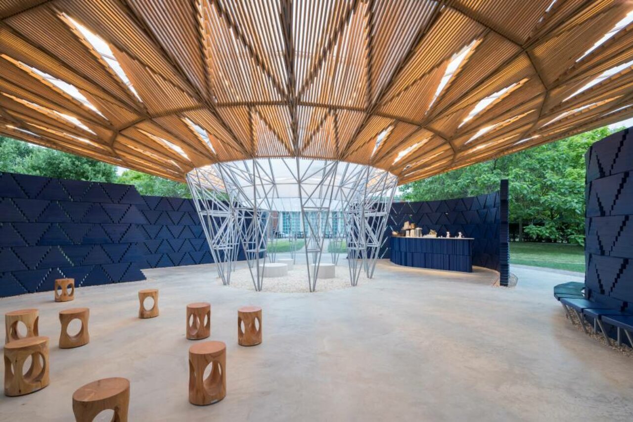
The award-winning, socially engaged and ecological design-led architect from Gando, Burkina Faso, Diébédo Francis Kéré, designed the 2017 Serpentine Pavilion as a bold structure, both in colour, form and concept inspired by his own architectural ethos of gathering, debate and community.
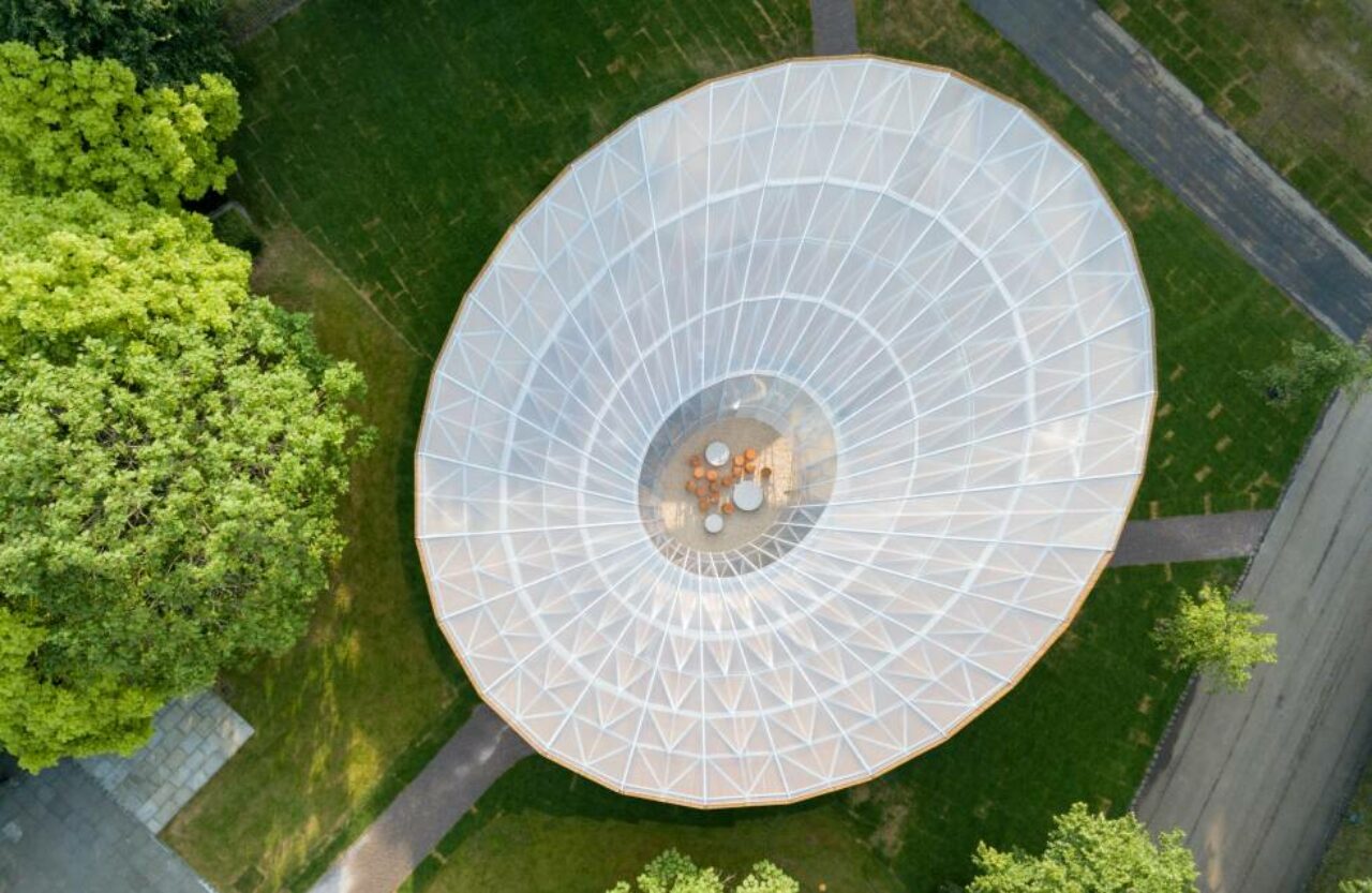
Inspired by the tree that serves as a central meeting point for daily life in his home town of Gando, Francis Kéré aimed for his pavilion design to connect visitors to nature – and furthermore, to each other. With an expansive timber roof and wall system made from timber supported by a central steel framework, the pavilion mimicked a tree’s canopy, allowing air to circulate freely while offering shelter against London rain and summer heat. The Pavilion had four separate entry points with an open air courtyard in the centre and had a central oculus ceiling opening that during rainy days, funnelled water to create a waterfall, that was collected through a drainage system in the floor leading to irrigate the surrounding garden.
Inspired by Kéré’s community-led approach, the pavilion also hosted a new series of weekly community picnic talks as Radical Kitchen, where different London group or campaign organisation assembled in the Pavilion to share their recipes for creating meaningful social change. Forging a connection with food, these picnics were co-hosted and catered by Mazí Mas, a pop-up restaurant and award-winning social enterprise run by migrant women, which seeks to unearth the flavours of modern London for everyone.
Materials: British timber roof and walling, with central steel framework
2016
Bjarke Ingels Group (BIG)
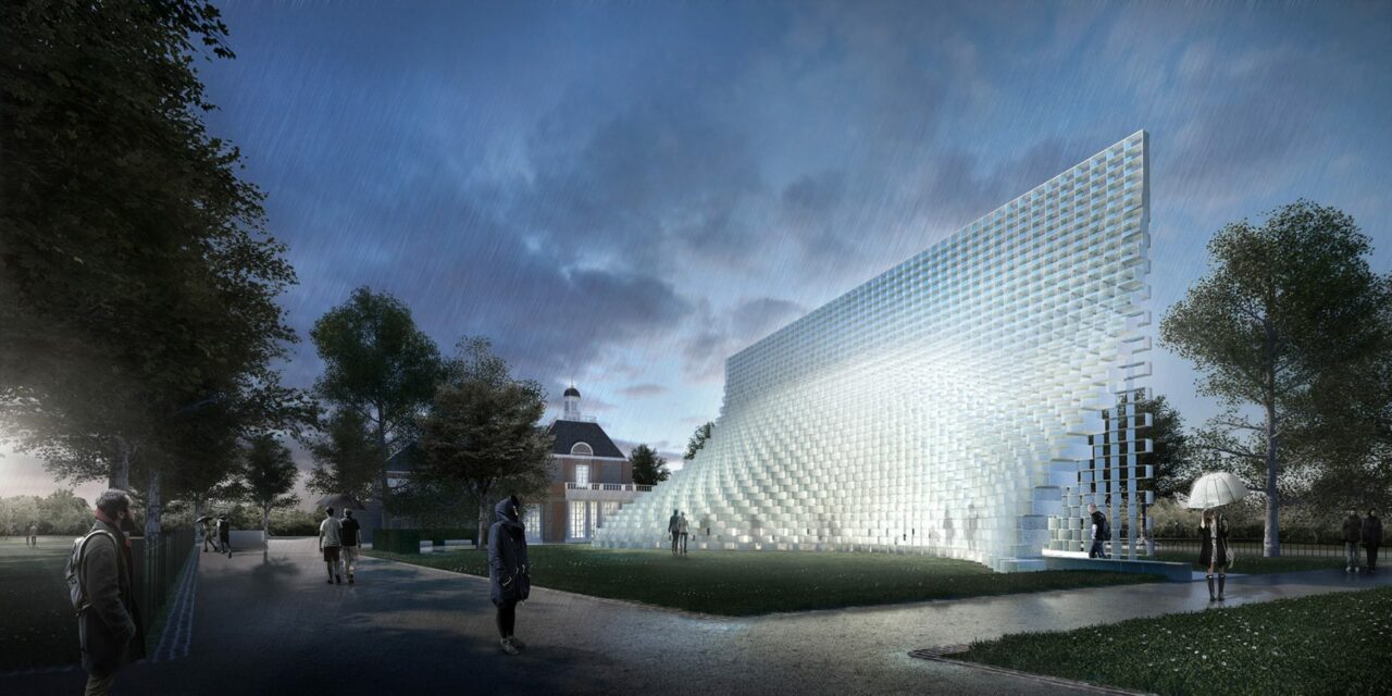
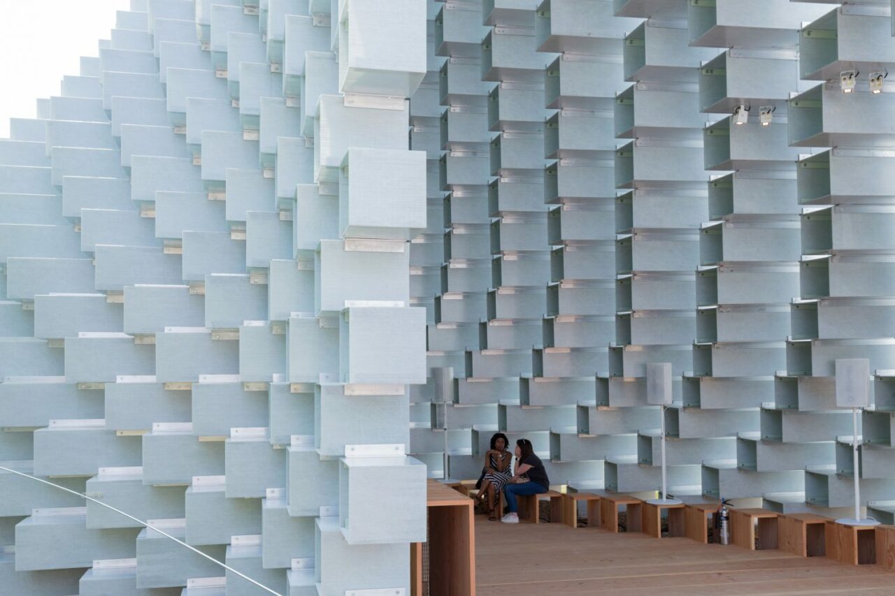
Bjarke Ingels Group (BIG) was commissioned to create the 2016 Serpentine Pavilion, referred to as an “unzipped wall”, created from the concept of a straight line to three-dimensional space led by juxtaposed contradictions — free-form yet rigorous; modular yet sculptural; both transparent and opaque; both solid box and blob. The Pavilion’s wooden floors and extruded Fiberline profiles provides every surface with a warm glow and linear texture – from the mesh of woven glass fibres to the undulating lines of the grain of wood.
The Pavilion structure was informed by stacking the translucent resin of the fibreglass frames to create an undulating form akin to a cave. Ingels noted, “We decided to work with one of the most basic elements of architecture: the brick wall. Rather than clay bricks or stone blocks, however, the wall is erected from pultruded fibreglass frames stacked on top of each other. The wall is then pulled apart to form a cavity within it, to house the events of the Pavilion’s programme. This unzipping of the wall turns the line into a surface, transforming the wall into a space. A complex three-dimensional environment is created that can be explored and experienced in a variety of ways, inside and outside. At the top, the wall appears like a straight line, while the bottom of it forms a sheltered valley at the entrance of the Pavilion and undulating hillside towards the Park. This simple manipulation of the archetypal space-defining garden wall creates a presence in the Park that changes as you move around it and as you move through it. The North-South elevation of the Pavilion is a perfect rectangle. The East-West elevation is an undulating sculptural silhouette. Towards the East-West, the Pavilion is completely opaque and material. Towards the North-South, it is entirely transparent and practically immaterial. As a result, presence becomes absence, orthogonal becomes curvilinear, structure becomes gesture, and box becomes blob.”
Material: Timber flooring, resin and Fiberline fibreglass frame bricks
2015
selgascano
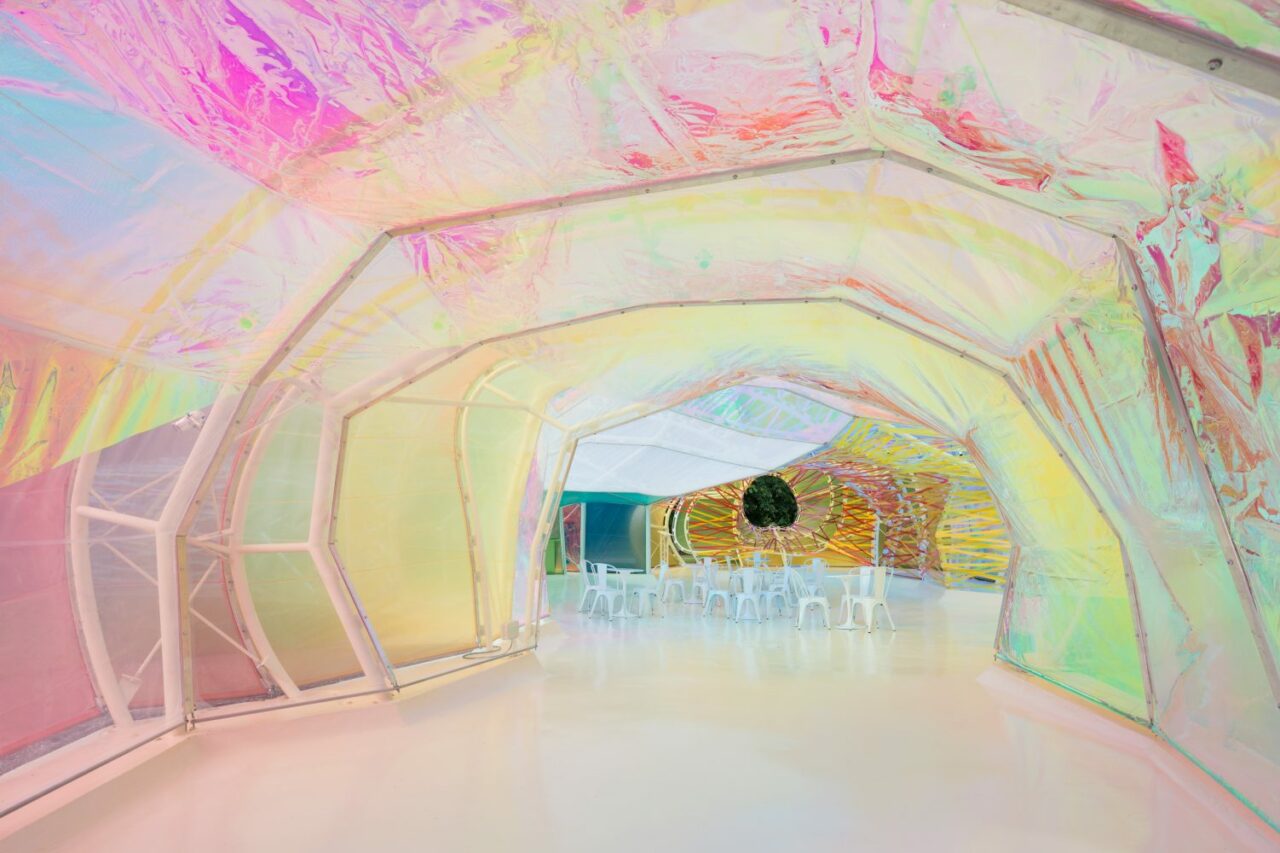
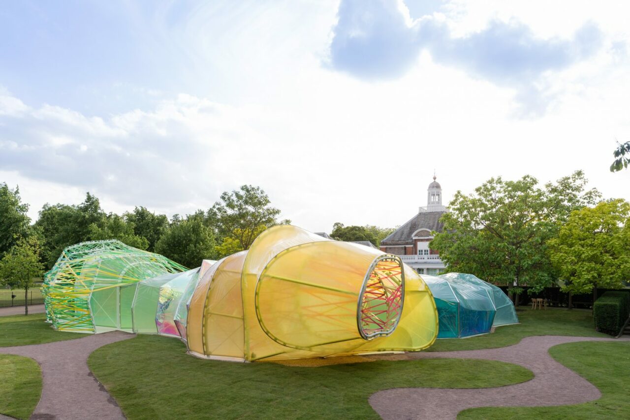
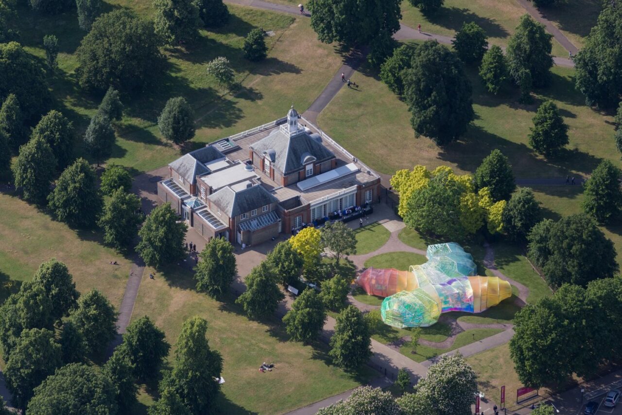
Award-winning Spanish architects selgascano led by José Selgas and Lucía Cano were invited to design the 15th Serpentine Pavilion, creating a multi-coloured, translucent organic form of fluorine-based plastic (ETFE) woven through and wrapped like webbing that when illuminated by natural light, offered a subdued light akin to stained glass. As an amorphous, double-skinned polygonal structure it offered numerous entry and exit points, and even a ‘secret corridor’ between the outer and inner layer of the structure.
selgascano explained, “We sought a way to allow the public to experience architecture through simple elements: structure, light, transparency, shadows, lightness, form, sensitivity, change, surprise, colour and materials. We have therefore designed a Pavilion which incorporates all of these elements. The spatial qualities of the Pavilion only unfold when accessing the structure and being immersed within it. Each entrance allows for a specific journey through the space, characterised by colour, light and irregular shapes with surprising volumes. This is accomplished by creating a double-layered shell, made of opaque and translucent fluorine-based plastic (ETFE) in a variety of colours. At the heart of the Pavilion is an open space for gathering as well as a café.”
Material: Fluorine-based plastic (ETFE)
2014
Smiljan Radić
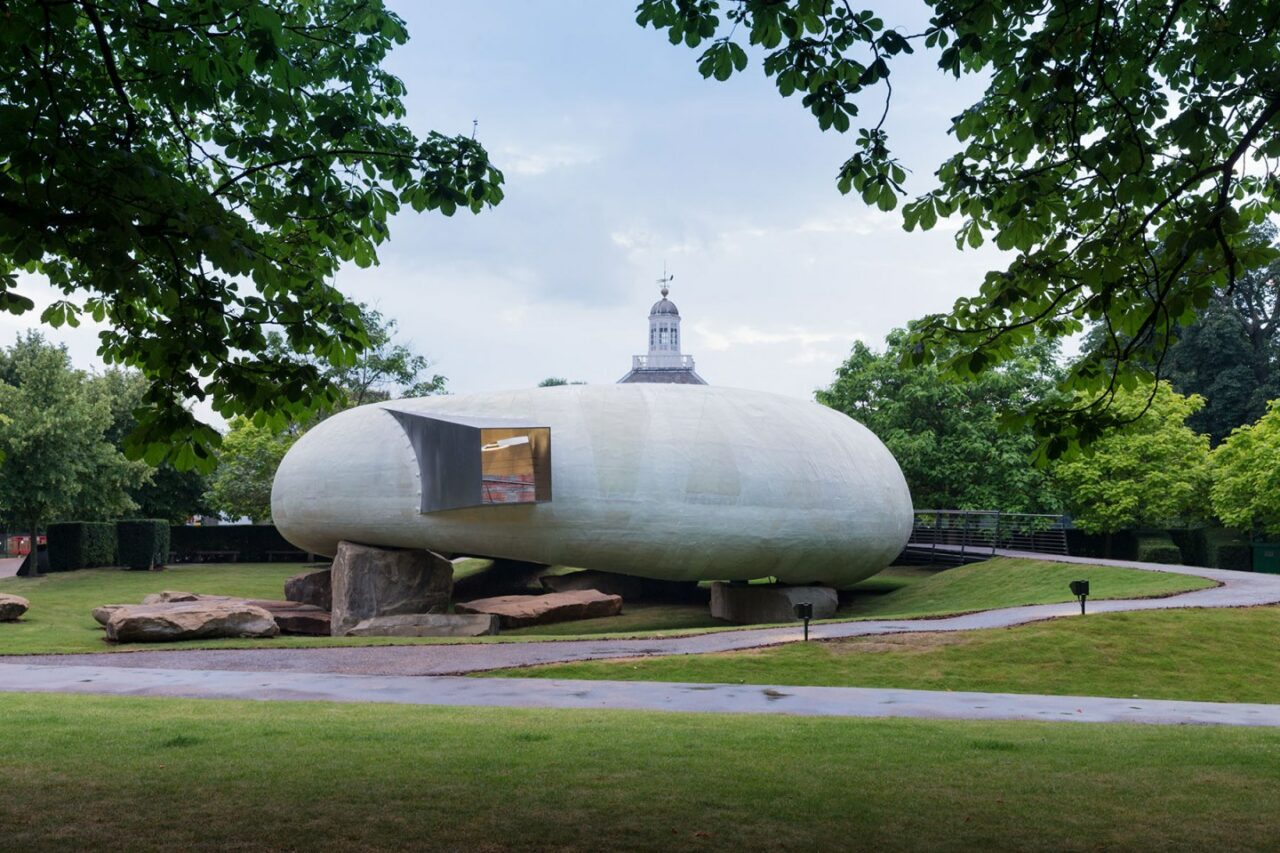
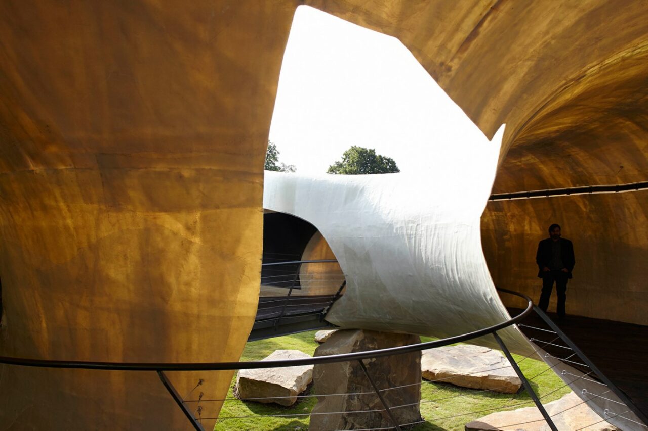
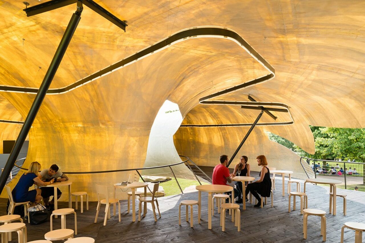
Chilean architect Smiljan Radić was invited to design the 14th Serpentine Pavilion, creating a semi-translucent, cylindrical structure reflecting handmade “crude architecture” that also resembled a shell. The semi-translucent, cylindrical structure engineering by Aecom rested on large quarry stones and appeared to be floating — it’s form inspired by a papier mâché model which Radić created four years ago as a response to the Oscar Wilde story ‘The Selfish Giant‘, and referencing the Restaurant Mestizo (also supported by large boulders). At night, the Pavilion’s translucent interior was mesmerisingly illuminated, guiding visitors like a “moth to a flame”.
This radical design by Radić reflects his ongoing design ethos of the consideration of social conditions, environments and materials. He moves freely across boundaries, avoiding any specific categorisation within one field of architecture. Drawing and model-making are an integral part of Radić’s design process. Julia Peyton-Jones noted: “while enigmatically archaic, in the tradition of romantic follies, Radic’s designs for the Pavilion also look excitingly futuristic, appearing like an alien space pod that has come to rest on a Neolithic site.”
Material: Paper-thin white fibreglass, timber decking, quarry stones
2013
Sou Fujimoto
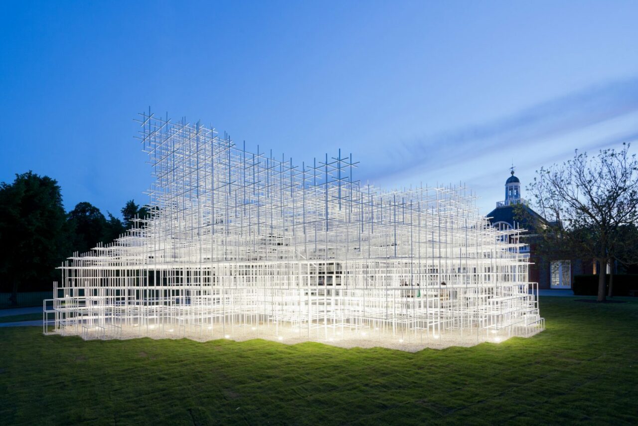
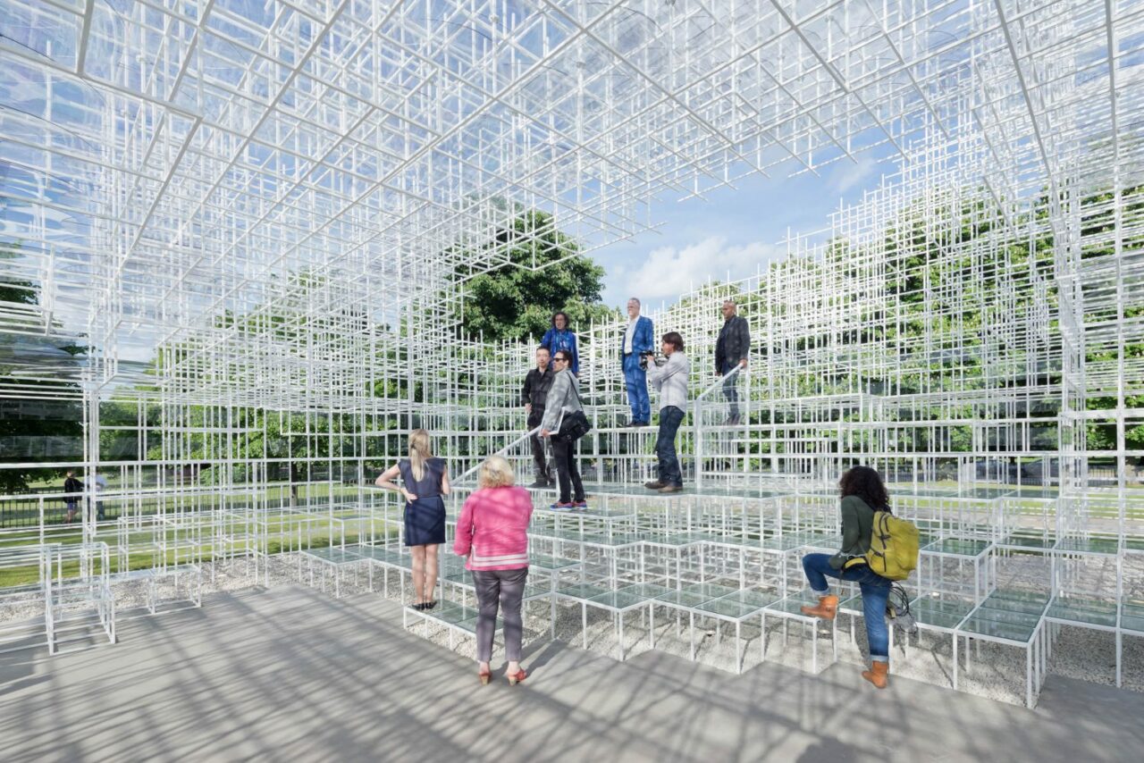
Japanese architect Sou Fujimoto‘s 2013 Serpentine Pavilion was an exercise in lightness and transparency, utilising the surrounding nature as its main feature. Constructed from 20mm white steel poles in an intricate latticework pattern that seemed to rise up out of the ground like a shimmering matrix, the Pavilion was intended as a free-flowing social space that Fujimoto described as “a transparent terrain”.
Akin to a cloud, Fujimoto’s delicate structure had a lightweight and semi-transparent appearance that allowed it to blend into the landscape. Fujimoto noted, “For the 2013 Pavilion, I propose an architectural landscape: a transparent terrain that encourages people to interact with and explore the site in diverse ways. Within the pastoral context of Kensington Gardens, I envisage the vivid greenery of the surrounding plant life woven together with a constructed geometry. A new form of environment will be created, where the natural and the man-made merge; not solely architectural nor solely natural, but a unique meeting of the two.”
Material: 20mm white steel poles
2012
Herzog & de Meuron and Ai Weiwei
As s first collaborative built structure in the UK (after their Beijing National Stadium which won the prestigious RIBA Lubetkin Prize),
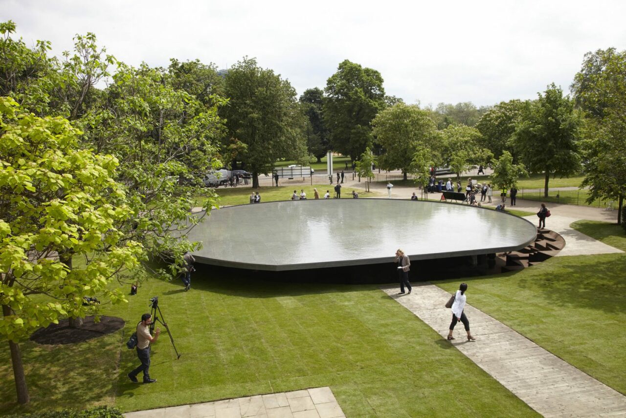
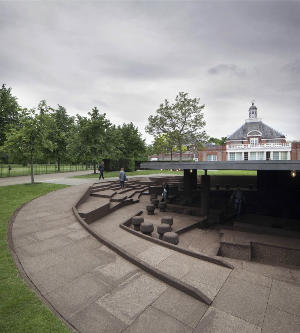
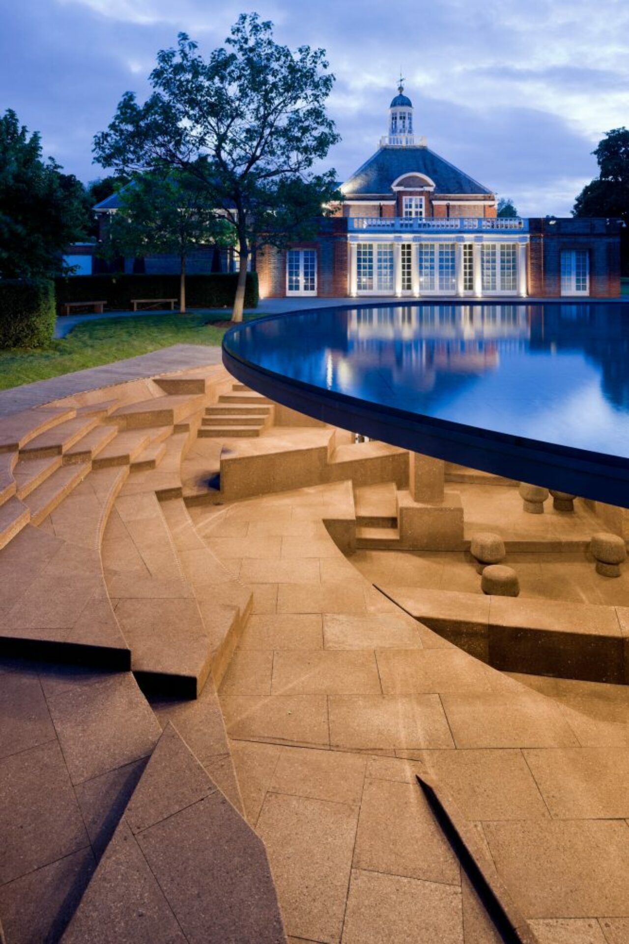
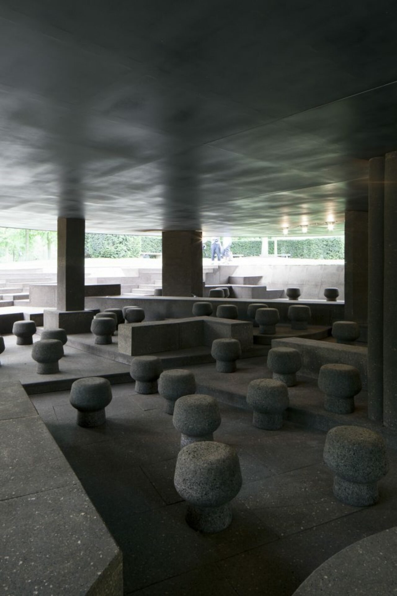
The 2012 Serpentine Pavilion by Swiss architecture firm Herzog & de Meuron and Chinese artist Ai Weiwei took visitors beneath the Serpentine’s lawn to both figuratively and literally explore the hidden history of previous pavilions by taking an archaeological approach by digging five feet down into the site, and creating a sunken pavilion. As an underground pavilion, its interior was sustainably made with cork and featured a circular pool as the roofing, supported by twelve columns. The sunken design inspired visitors to look beneath the surface of the park as well as back in time across the ghosts of the earlier structures.
Material: Cork, water
2011
Peter Zumthor
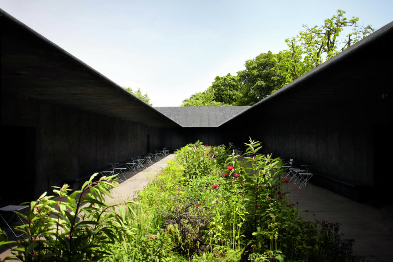
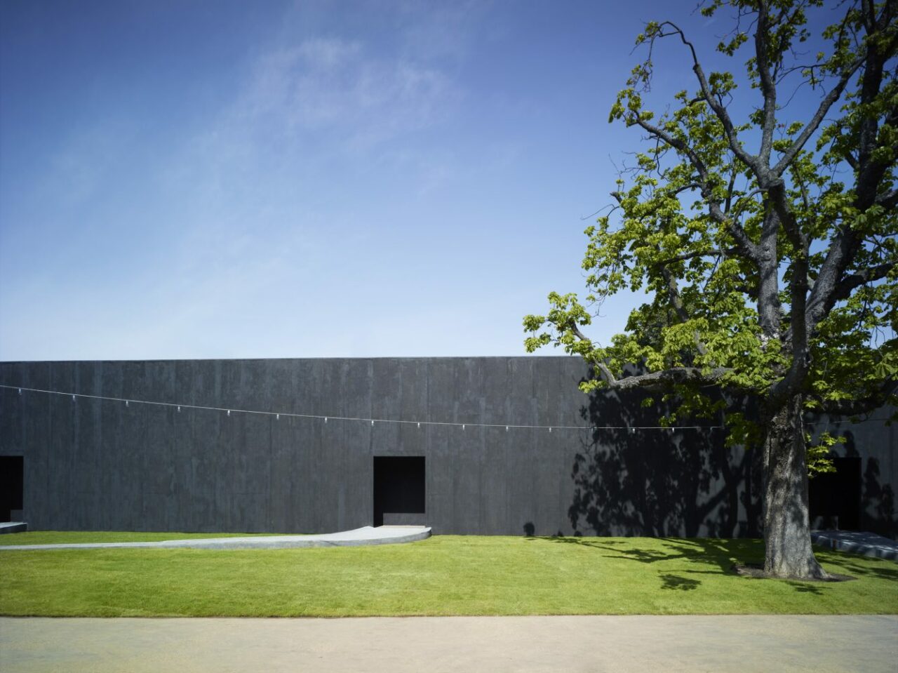
The 2011 Serpentine Pavilion by Swiss architect Peter Zumthor was led by a design that brought the outside in, creating a meditative space in the form of a garden (created garden by the influential Dutch designer Piet Oudolf) within a rectangular, black-painted enclosed exterior wall. The concept for the Pavilion was the hortus conclusus, a contemplative room, a garden within a garden. Visitors entered the building from the lawn and began the transition into the central garden, a place abstracted from the world of noise, traffic and the smells of London – an interior space within which to sit, to walk, to observe the flowers. The design emphasised the role the senses and emotions play in our experience of architecture, as a contemplative space that evokes the spiritual dimension of our physical environment. As always, Zumthor’s aesthetic goal was to customise the building precisely to its purpose as a physical body and an object of emotional experience.
Zumthor noted, “A garden is the most intimate landscape ensemble I know of. It is close to us. There we cultivate the plants we need. A garden requires care and protection. And so we encircle it, we defend it and fend for it. We give it shelter. The garden turns into a place.”
Materials: Timber-framed structure covered in gauze painted with black adhesive, with an interior garden by Piet Oudolf
2010
Jean Nouvel
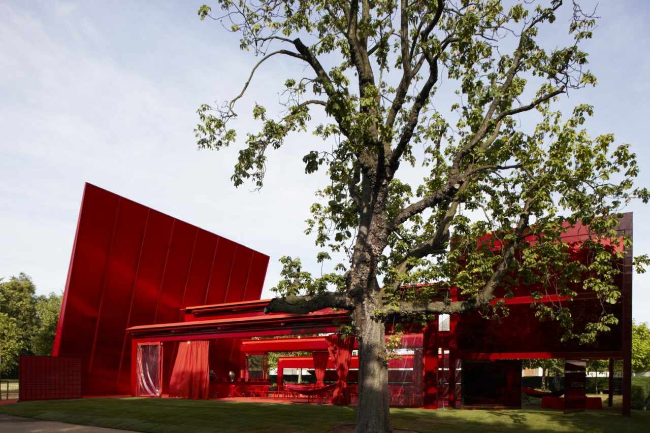
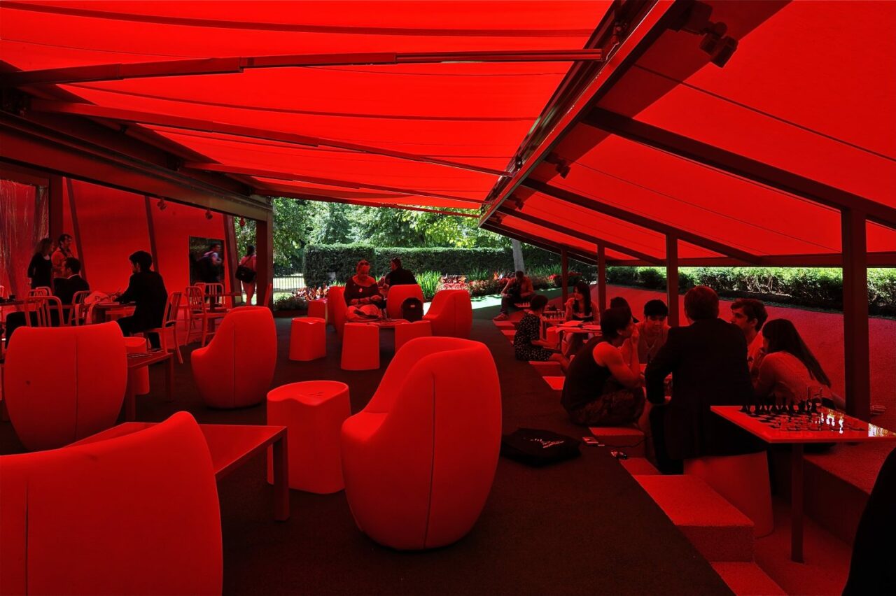
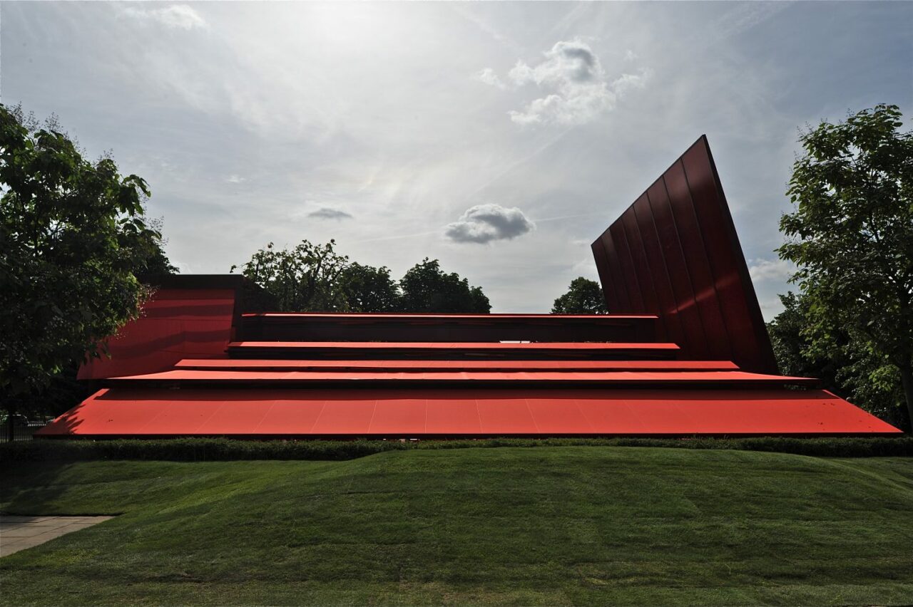
Designed by French architect Jean Nouvel, the 10th Serpentine Gallery Pavilion contrasted lightweight materials with dramatic metal cantilevered structures, rendered in a vivid bright red colour that, in a play of opposites, contrasted with the green of its park setting. It’s bold red colour was in reference to the iconic British traditional telephone boxes, postboxes and London buses with a structure formed by geometric forms made by glass, polycarbonate and fabric, featuring large retractable awnings and a sloped freestanding wall that stood 12m above the lawn.
Materials: Steel, glass, polycarbonate, fabric
2009
Kazuyo Sejima and Ryue Nishizawa (SANAA)
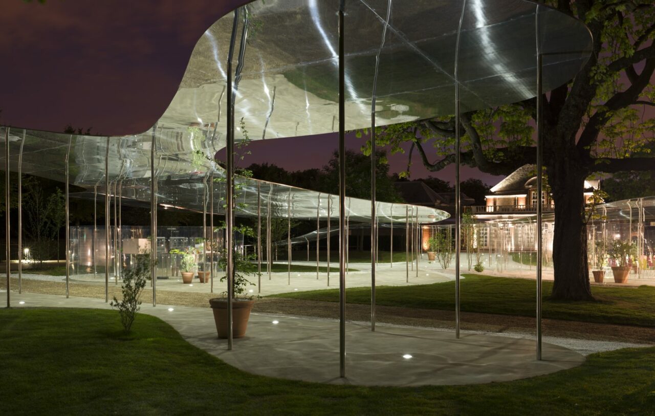
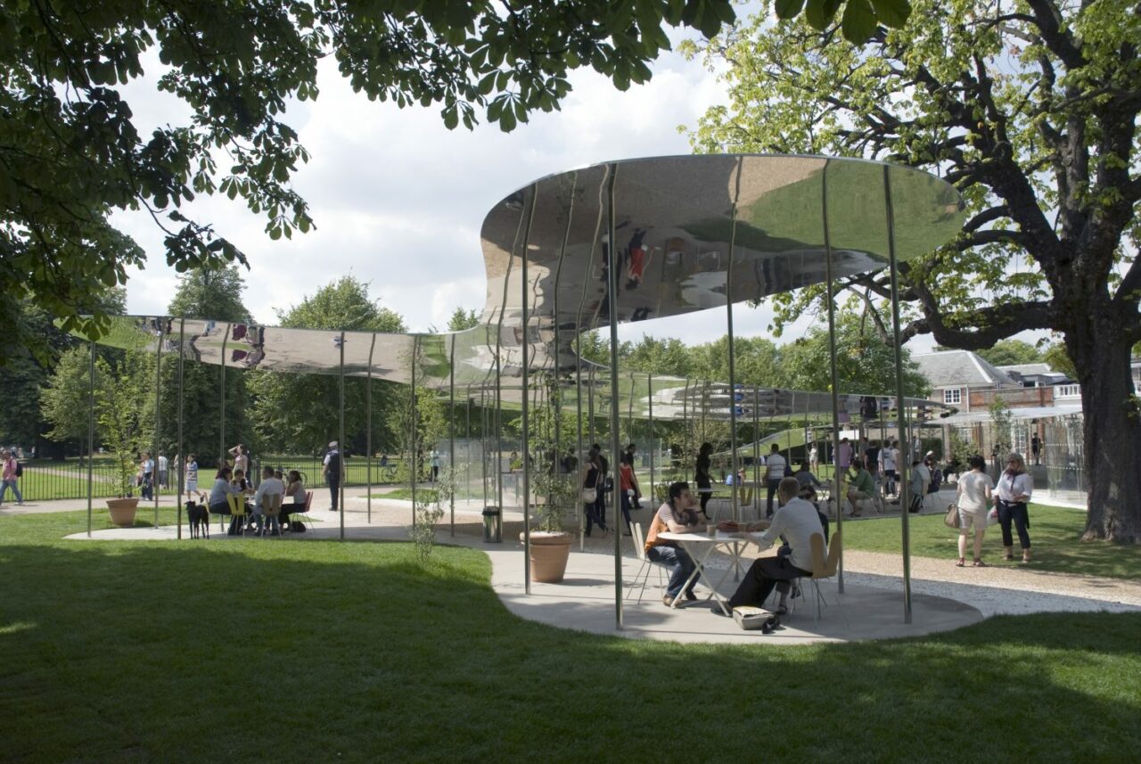
The 2009 Serpentine Pavilion was designed by Japanese architecture firm SANAA, led by Ryue Nishizawa and Kazuyo Sejima. The Pavilion resembled a reflective cloud or a floating pool of water sitting atop a series of delicate columns, with a metal roof structure that varied in height, wrapping itself around the trees in the park. Open and ephemeral in structure, its reflective materials made it seamlessly blend in within the surrounding natural environment, reflecting both the park and sky around it.
Sejima and Nishizawa noted: “The Pavilion is floating aluminium, drifting freely between the trees like smoke. Its appearance changes according to the weather, allowing it to melt into the surroundings. It works as a field of activity with no walls, allowing uninterrupted views across the park and encouraging access from all sides.”
Material: Metal, aluminium
2008
Frank Gehry
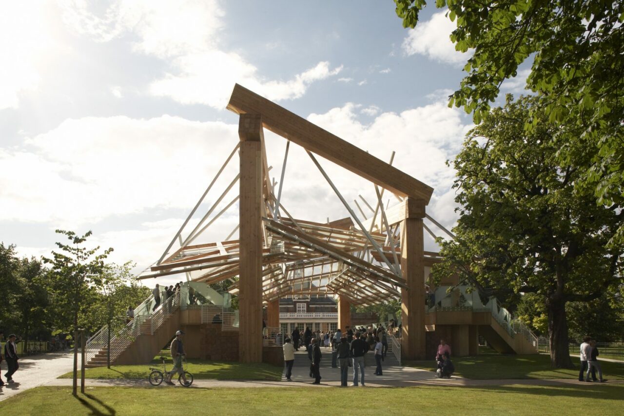
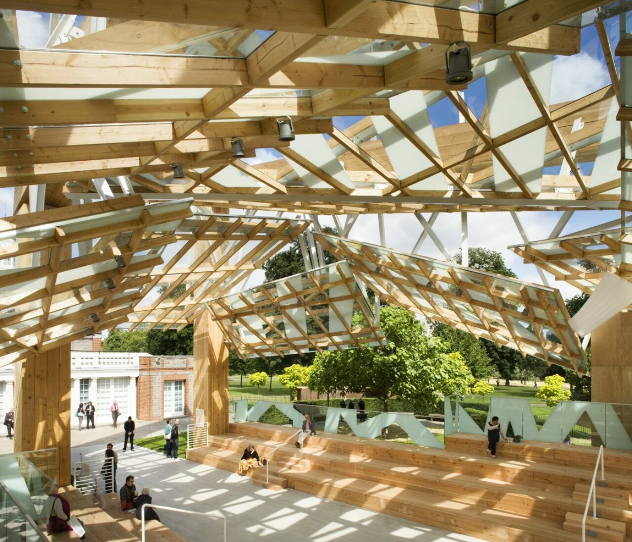
American architect Frank Gehry‘s 2008 Serpentine Pavilion was designed and engineered in collaboration with Arup, as a transparent timber structure anchored by four massive steel columns supporting the large timber planks and a complex network of overlapping glass planes that creating a multi-dimensional space. Inspired by the elaborate wooden catapults designed by Leonardo da Vinci, and striped walls of summer beach huts, the Pavilion was part-amphitheatre, part-promenade, allowing for reflection and relaxation by day, and discussion and performance by night.
For the Pavilion, Gehry collaborated for the first time with his son Samuel Gehry, and Peter Rogers, Director of Stanhope, who since 2001 has donated his expertise to all aspects of the Serpentine Gallery Pavilions. Gehry noted: “The Pavilion is designed as a wooden timber structure that acts as an urban street running from the park to the existing gallery. Inside the Pavilion, glass canopies are hung from the wooden structure to protect the interior from wind and rain and provide for shade during sunny days. The Pavilion is much like an amphitheatre, designed to serve as a place for live events, music, performance, discussion and debate. As the visitor walks through the Pavilion, they have access to terraced seating on both sides of the urban street. In addition to the terraced seating, there are two elevated seating pods, which are accessed around the perimeter of the Pavilion. These pods serve as visual markers enclosing the street and can be used as stages, private viewing platforms and dining areas.”
Materials: Steel columns, timber planks, glass planes
2007
Olafur Eliasson and architect Kjetil Thorsen
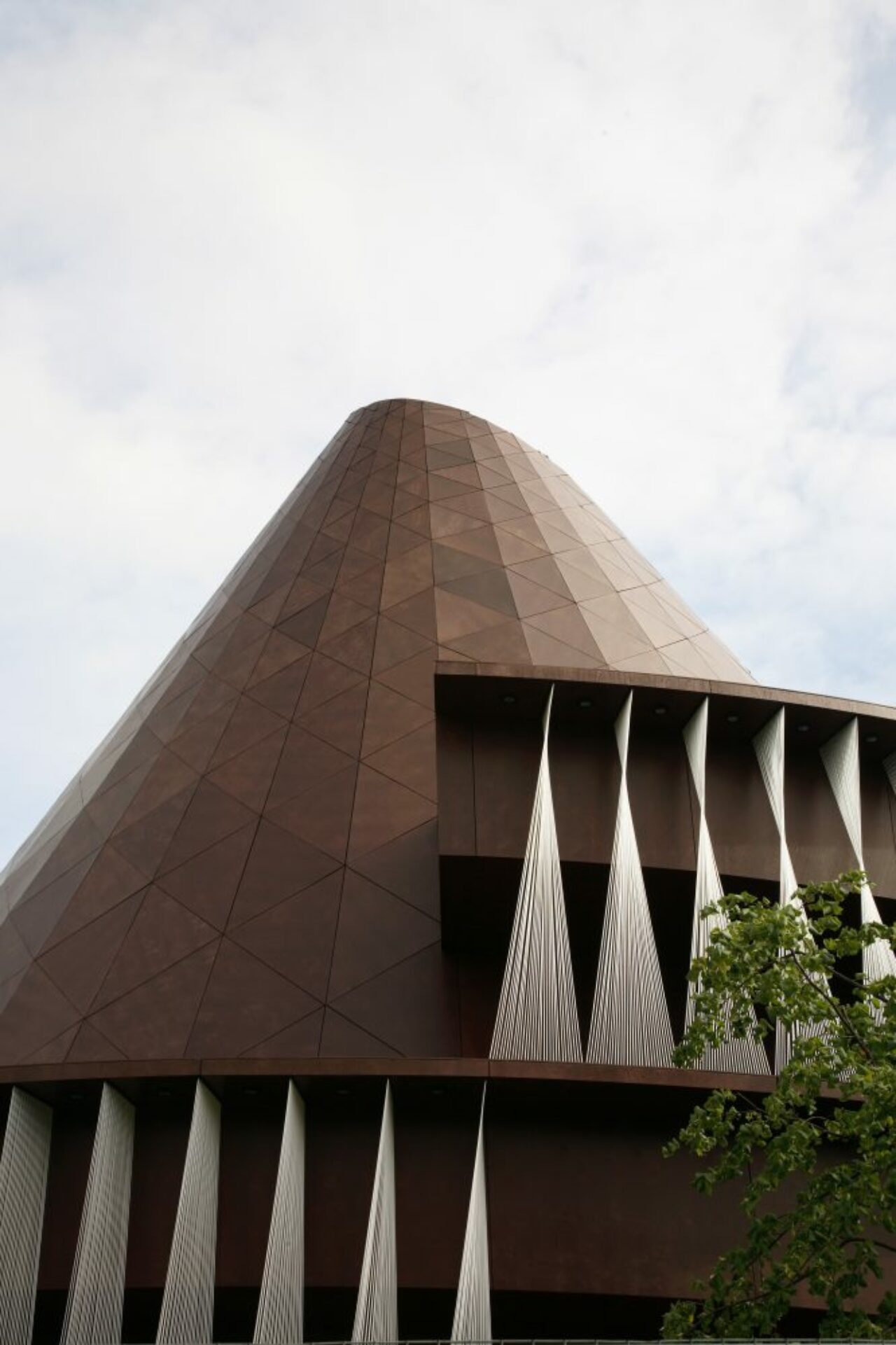
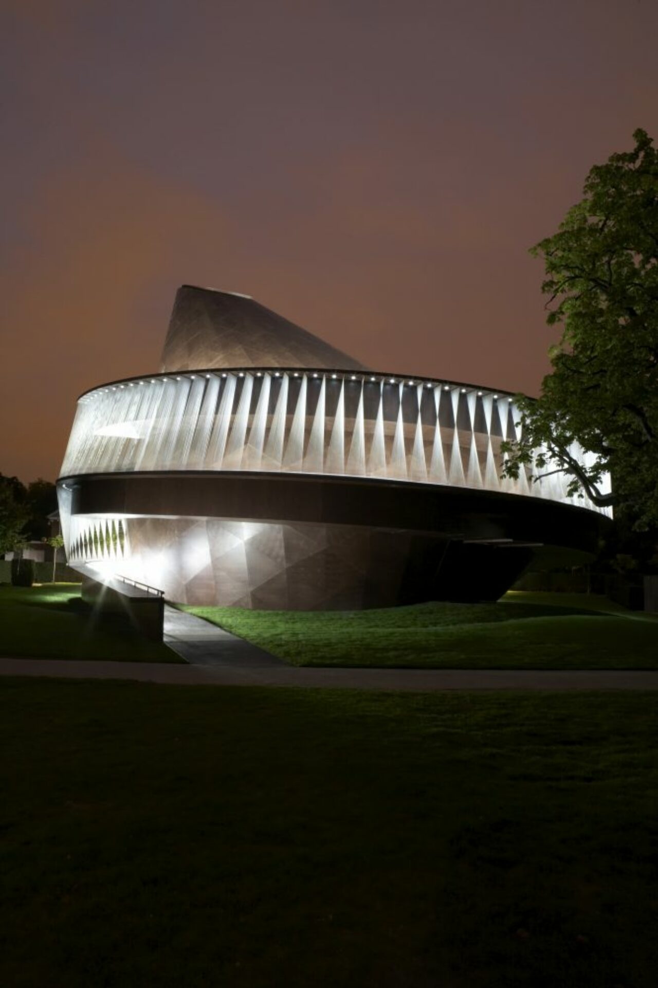
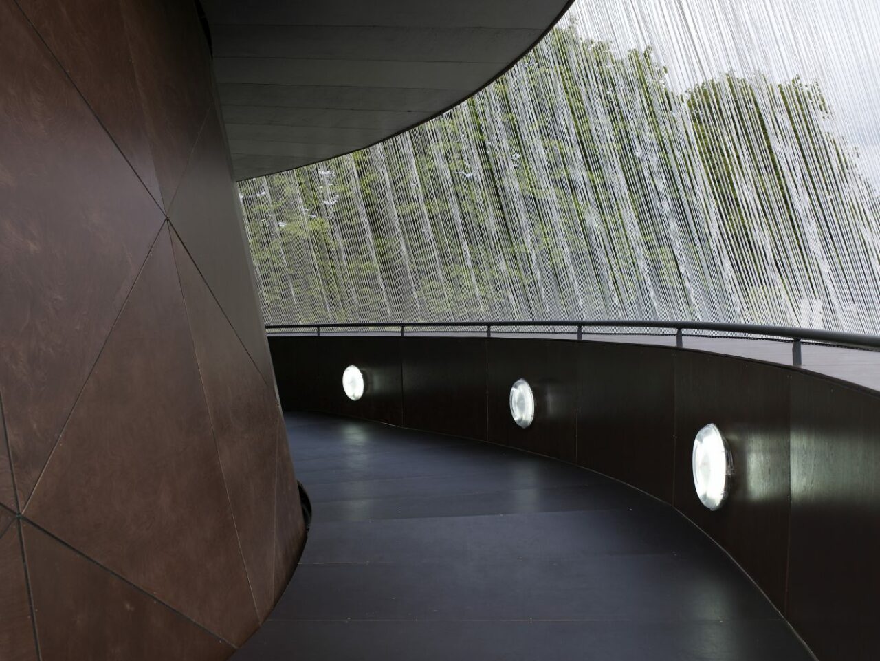
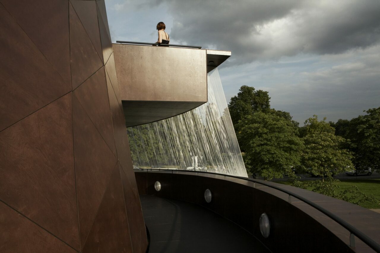
Serpentine Gallery’s 2007 Pavilion was designed by artist Olafur Eliasson and architect Kjetil Thorsen of architectural firm Snøhetta, as a timber-clad structure resembling a spinning top, creating a dramatic vertical dimension to usual single-storey pavilions. With a 140m spiralling ramp that made two complete turns, ascending from the gallery’s lawn to the seating area and continued upwards, culminating at the highest point in a view across Kensington Gardens and down into the chamber below allowing for natural light to enter the interior from above via an ellipsoidal oculus.
The Pavilion acted as a ‘laboratory’ every Friday night with artists, architects, academics and scientists leading a series of public experiments. The programme Eliasson and Thorsen conceived with the Serpentine began in September and culminated in an extraordinary, two-part, 48-hour Experiment Marathon event exploring the architecture of the senses.
Materials: Timber, twisted cord louvres
2006
Rem Koolhaas and Cecil Balmond with ARUP
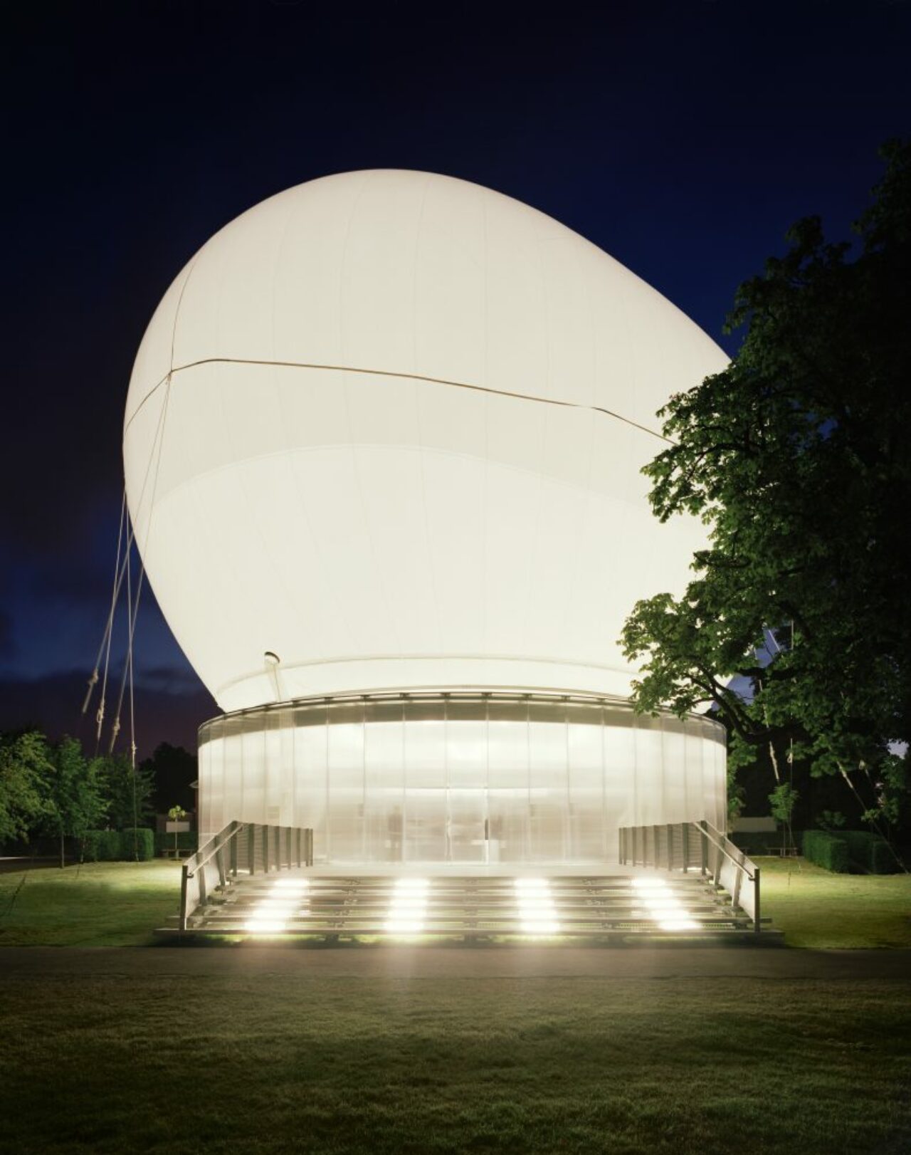
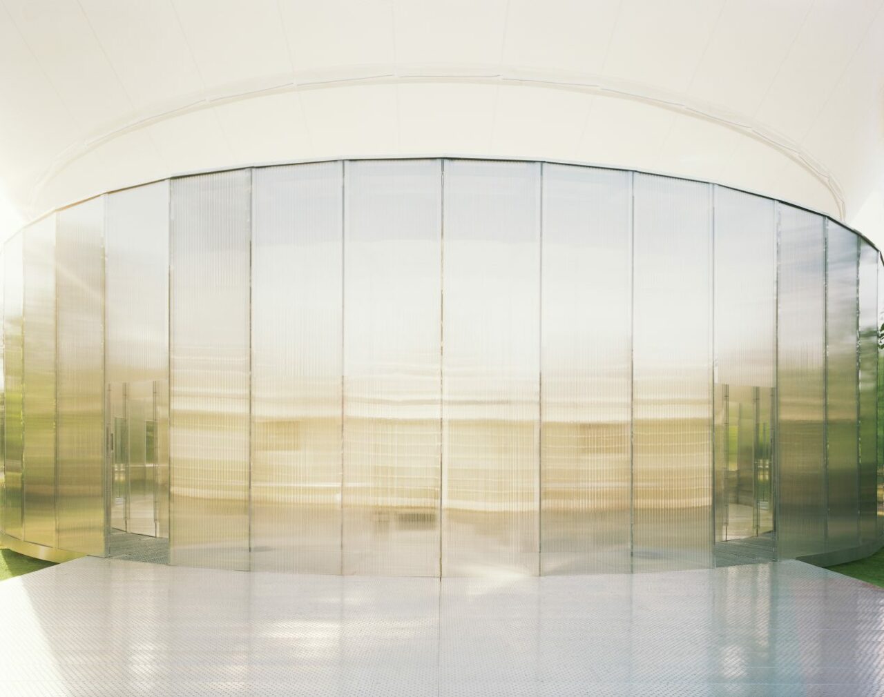
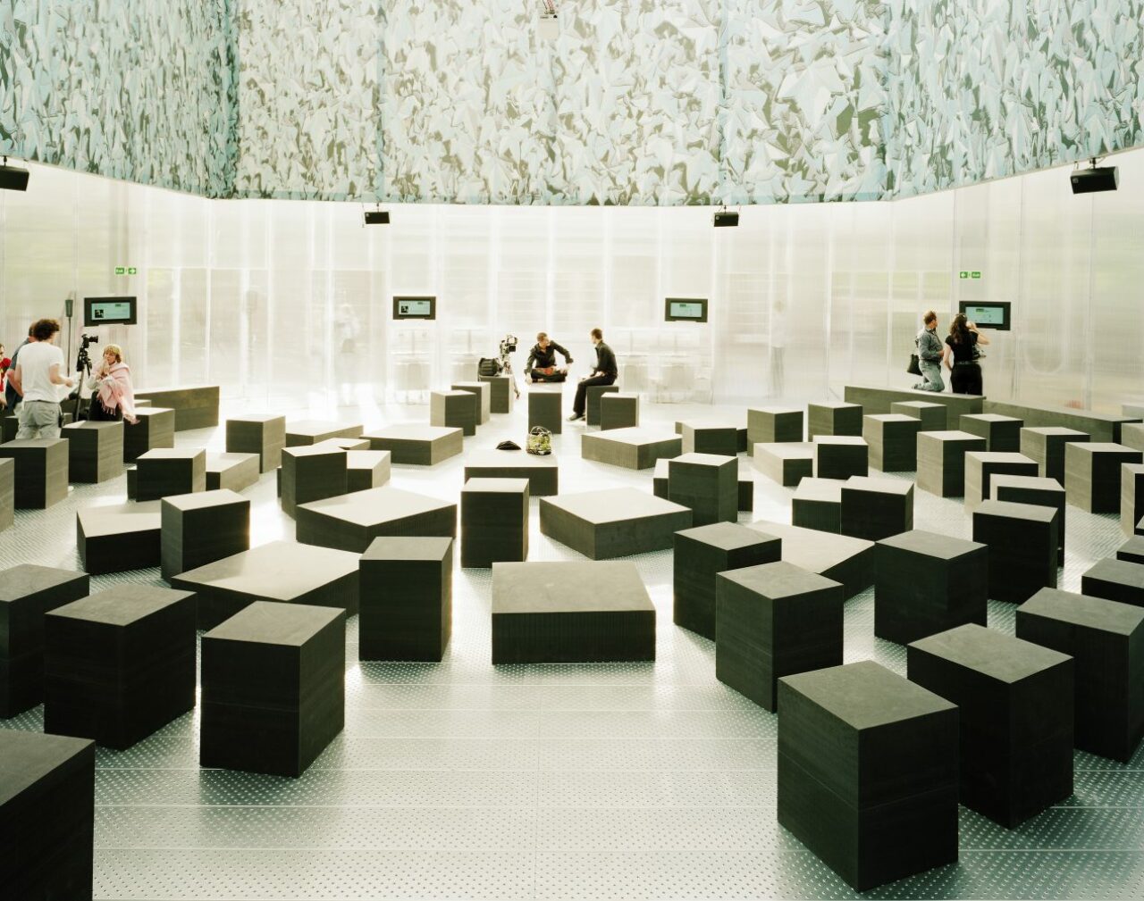
Architect Rem Koolhaas of Dutch architecture practice OMA partnered with innovative structural designer Cecil Balmond and engineering firm ARUP to co-design the 2006 Serpentine Gallery Pavilion which would come to be referred to as “The Cosmic Egg”.
As a floating canopy, the ovoid-shaped inflatable structure was made from translucent material and illuminated from within at night. The canopy was raised into the air or lowered to cover the amphitheatre below according to the weather.
It was an exploration into the nature of a pavilion, and interrogated the concept of non-structure. This pavilion was an event, a ‘happening’ that marked the beginning of the popular Serpentine Marathons (convened by Koolhaas and Hans-Ulrich Obrist) and featuring leading politicians, architects, philosophers, writers, artists, film-makers and economists exposing the hidden and invisible layers of London.
Materials: Galvanized steel structure, PVC covering
2005
Álvaro Siza and Eduardo Souto de Moura with Cecil Balmond and Arup
The 2005 Serpentine Pavilion was designed by Portuguese architects Alvaro Siza and Eduardo Souto de Moura. In designing the Pavilion, Siza sought to “guarantee that the new building – while presenting a totally different architecture – established a ‘dialogue’ with the neoclassical house”. The result was a structure that mirrored the domestic scale of the Serpentine and articulated the landscape between the two buildings. The Pavilion was based on a simple rectangular grid, which was distorted to create a dynamic curvaceous form. It comprised interlocking timber beams, a material that accentuated the relationship between the Pavilion and surrounding Park.
Material: Interlocking timber beams
2003
Oscar Niemeyer
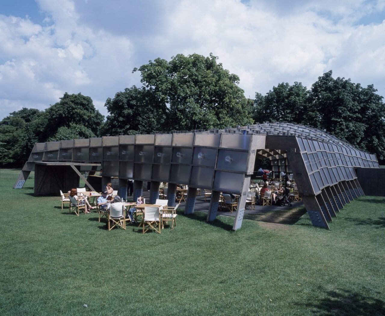
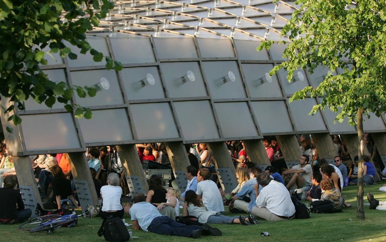
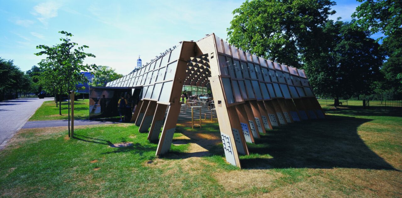
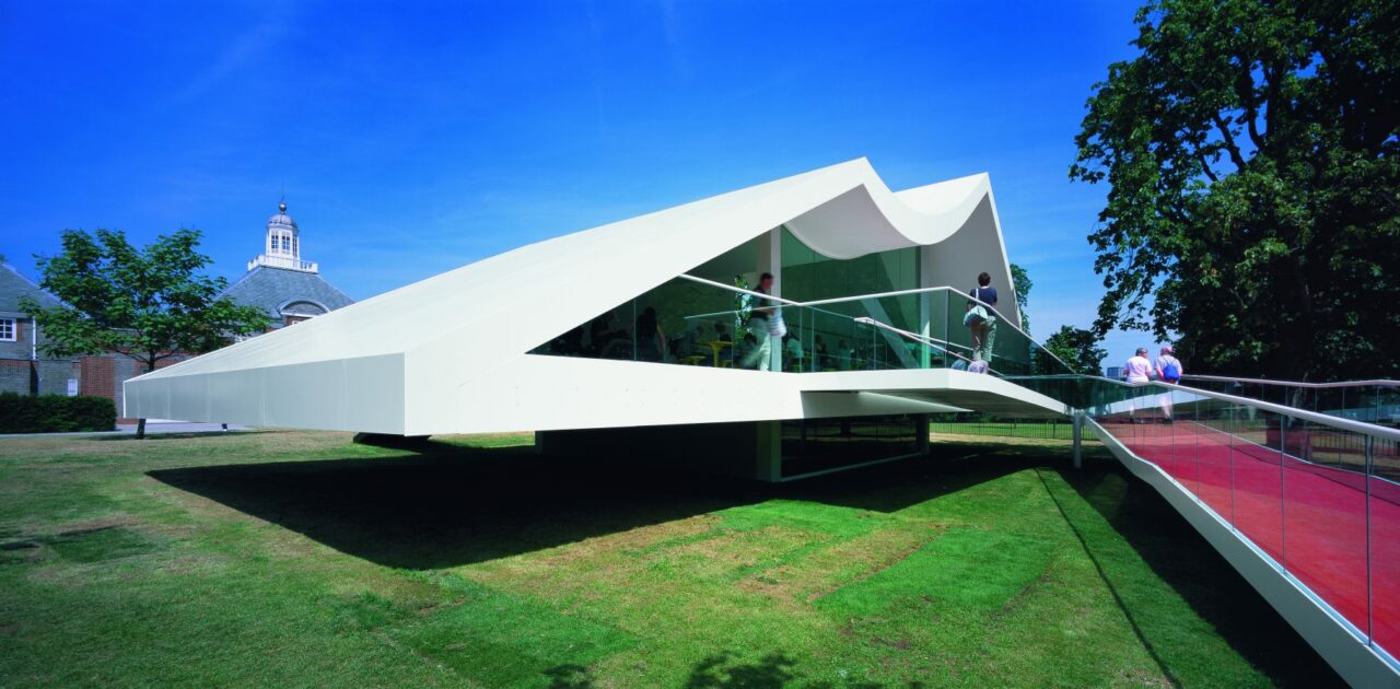
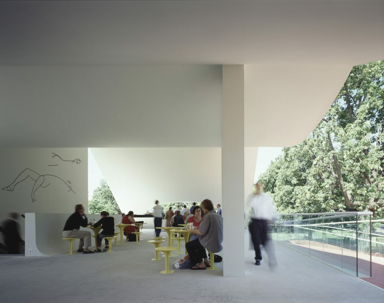
Brazilian architect Oscar Niemeyer’s design for the Serpentine Gallery Pavilion 2003 was noted as both simple and ingenious. Built in steel, aluminium, concrete and glass, its ruby-red ramp (inspired by Niterói Contemporary Art Museum) contrasted with the surprise of a partly submerged auditorium, affording views across the park. It also housed specially conceived wall drawings by Niemeyer. The Pavilion conformed to Niemeyer’s principle that every project must be capable of summary in a simple ‘sketch’ and that once the support structure is finished the architecture should be more or less complete.
Materials: Steel, aluminium, concrete, glass
2002
Toyo Ito and Cecil Balmond
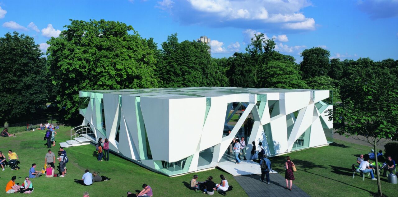
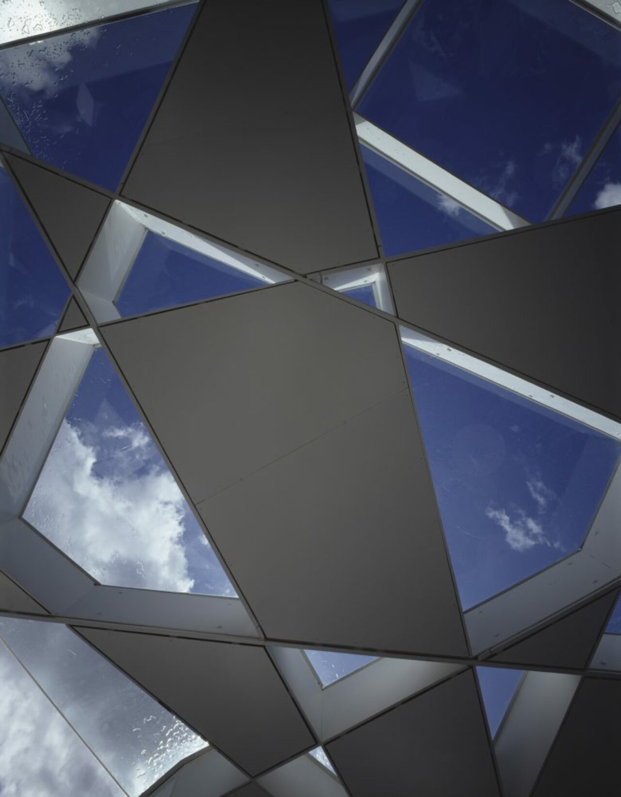
The Serpentine Gallery Pavilion 2002 by Japanese architect Toyo Ito and Cecil Balmond was based on the algorithm of a cube. Appearing as an extremely complex random pattern that proved, upon careful examination, to derive from an algorithm of a cube that expanded as it rotated. The numerous triangles and trapezoids formed by this system of intersecting lines were clad to be either transparent or translucent, giving a sense of infinitely repeated motion.
2001
DANIEL LIBESKIND
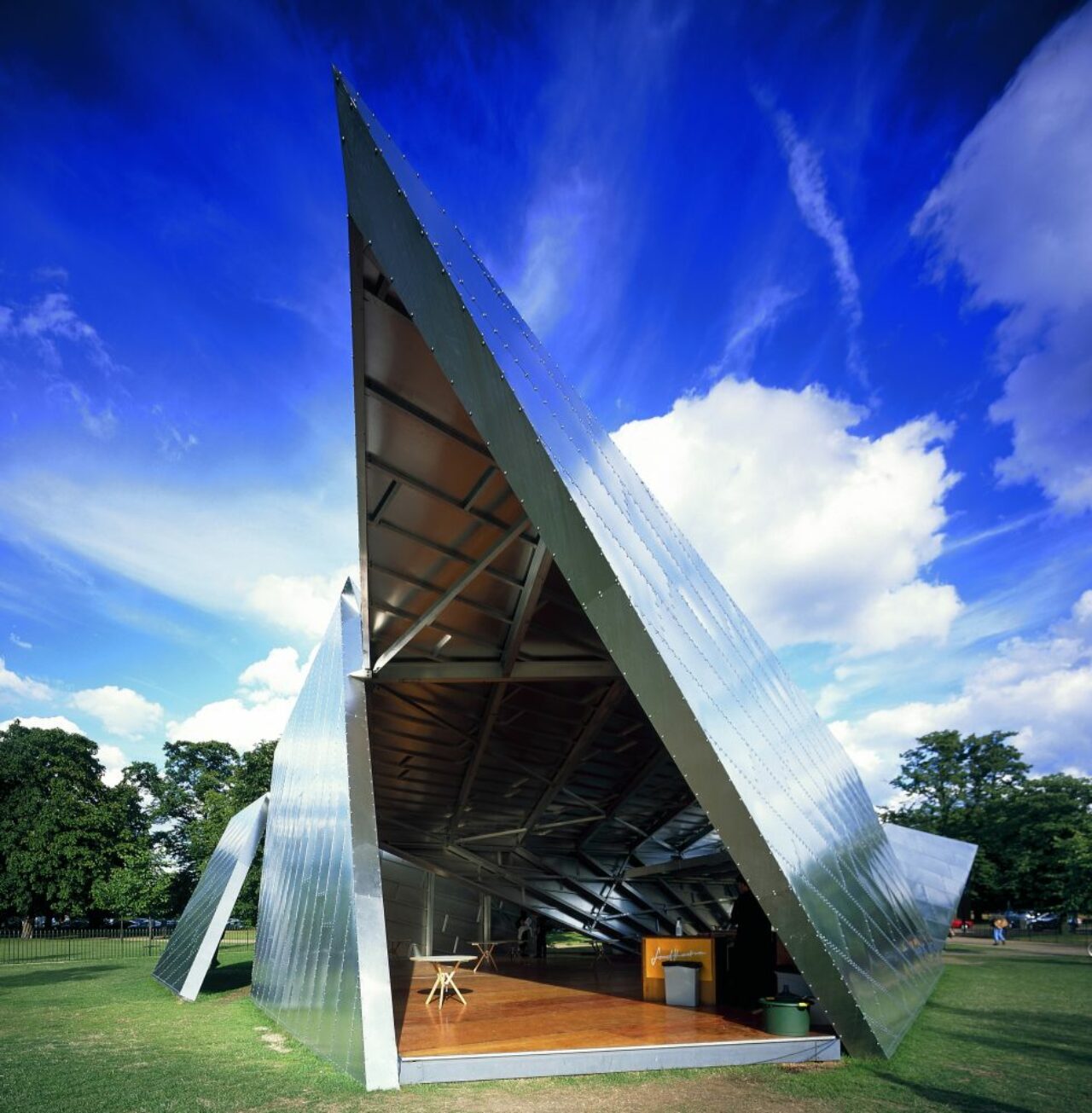
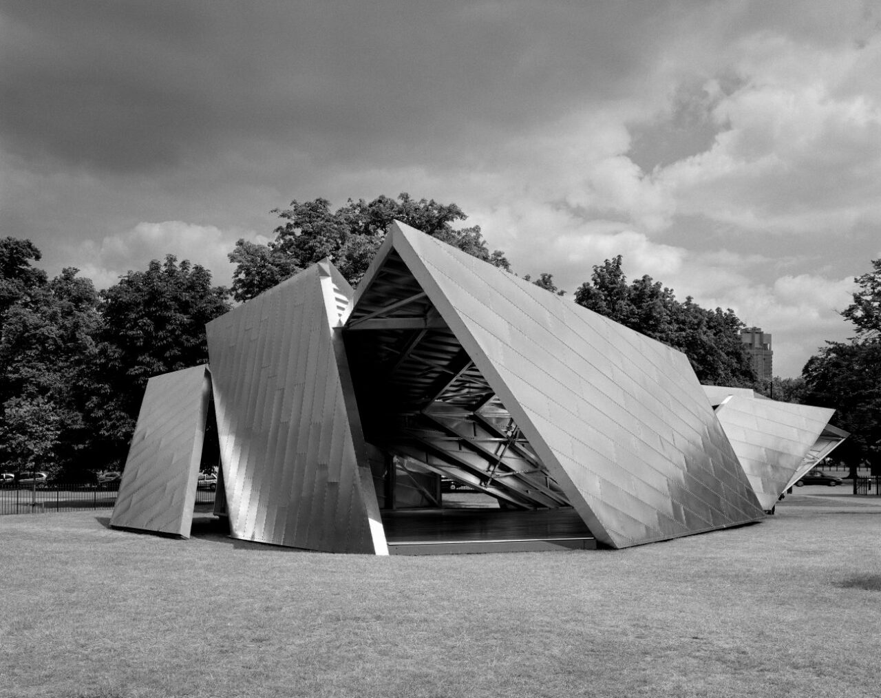
American-Polish architect Daniel Libeskind’s design for the Serpentine Gallery Pavilion 2001, entitled Eighteen Turns, was created from sheer metallic planes assembled in a dynamic sequence that was clad in aluminium panels creating brilliant reflections of light.
Material: Aluminium panels, metallic planes
2000
ZAHA HADID
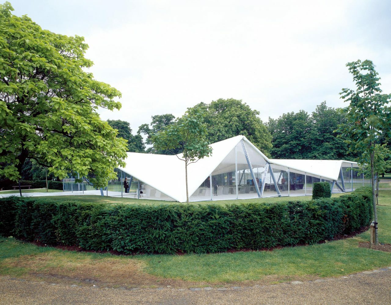
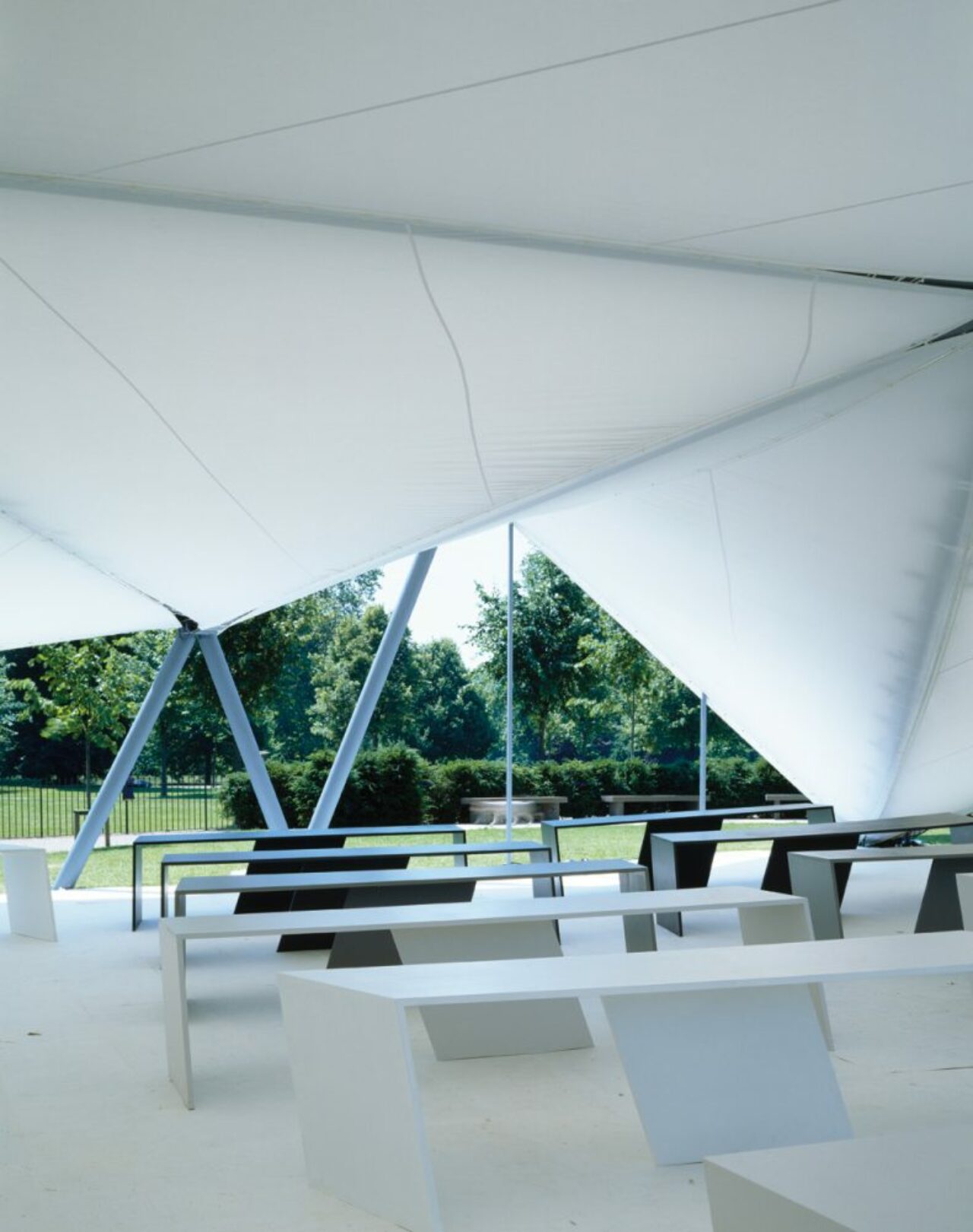
As the inaugural Serpentine Pavilion, Iraqi-British architect Zaha Hadid’s structure radically reinvented the accepted idea of a tent or a marquee. It took the form of a triangulated roof structure spanning an impressive internal space of 600 square metres by using a steel primary structure. A folding form of angular flat planes extending to the ground gave an illusion of solidity, while at the same time creating a variety of internal spaces.
Material: Steel
Text: Joanna Kawecki
Images: courtesy Serpentine Gallery


