ANDY HILLMAN
An Imagination Unconstrained - Leading The Way In Set Design & Fashion
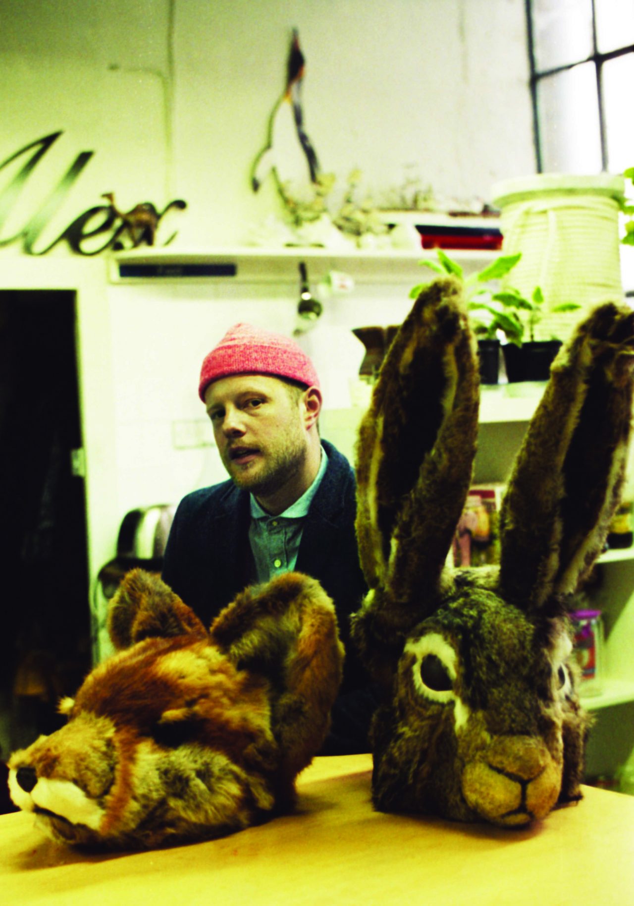
British set designer Andy Hillman has managed to seduce the fashion industry by bringing their wildest ideas into realisation through set design, a now celebrated trade that the designer himself also fell into.
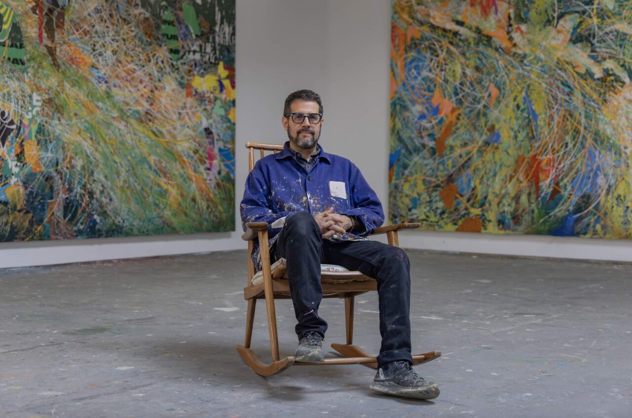
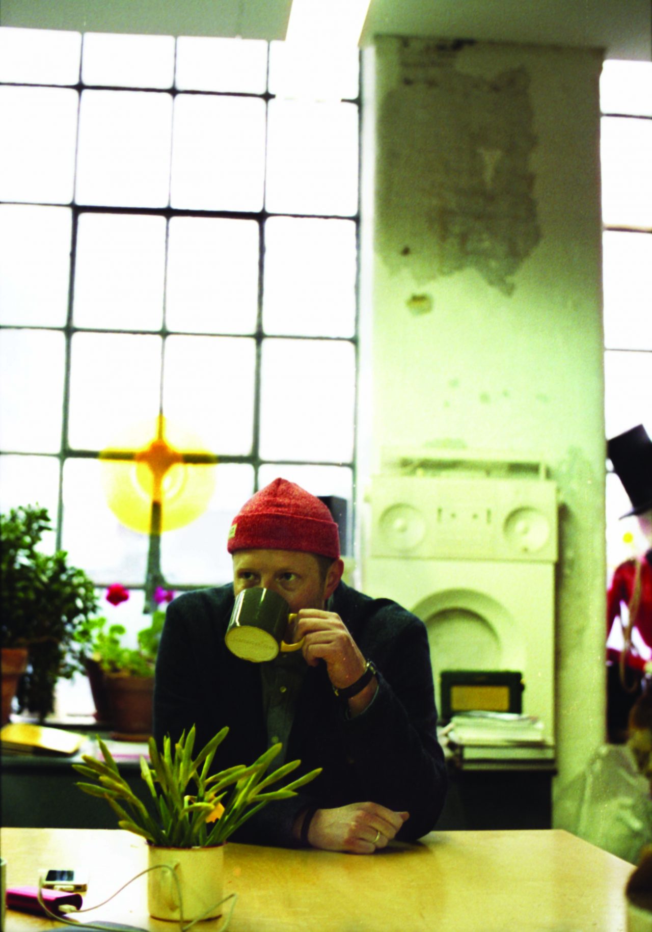
On a rainy and typically British morning in London, we meet the designer at his studio in Angel, Islington. Our photographer Nicolo Terraneo already started shooting the modestly sized, yet practical and organised studio. For a designer working on some very large scale projects, this is a surprisingly compact space, complete with a team of lovely and dedicated ladies all working together as part of the Andy Hillman Studio.
The Studio has been busy recently, with a current window display in completion for Liberty’s of London, and their ongoing collaborations for Dover Street Market and DSM Ginza. More work spans various mediums, such as retail spaces, fashion in film and in print editorials. Publications W, British and Italian Vogue, Another, Interview and LOVE, have all worked with the designer and his team to create magical wonderlands for their readers.
Set Design as a recognised occupation is fairly new in the fashion industry. With the likes of Tim Walker, Craig McDean and Miles Aldridge amongst others working together with set designers, to utilise sculptures and bring to life their conceptual ideas. Anything is possible, and especially visually-pleasing creations in unimaginable physical form.
It is exactly these influential British photographers that Andy Hillman has worked with to create remarkable pieces and images. Fantasy becomes reality, executed perfectly by the optimistic and humble designer and his team.
With sights set on a bigger studio and new clients knocking on the door, the Andy Hillman Studio will continue to expand and surprise with each project, solidifying them as one of the most exciting set design studios in the world.
Monique Kawecki: Firstly, being British-born and raised, please tell us a little about your background.
Andy Hillman: I was born in Oxford but my dad was in the military so we moved around a lot as a family. I tend to say that I grew up in a town called Sidmouth in Devon where my grandparents lived because we spent a lot of time there when I was young.
I studied design at Three Dimensional Design at The Arts Institute in Bournemouth, specifically focussing more on product design. It just meant you get to try a little bit of everything, which was a broad spectrum, I suppose sort of Blue Sky thinking. Almost more like theory of design, you are designing things but you never truly execute them. It’s sort of like a philosophy degree [laughs] in the sense that it’s not terribly practical, but there’s still a lot to learn when you finish.
So when I finished I did some product design working for a couple of companies and didn’t really enjoy that. I think you’ve got to have a certain mindset and I’m always very in awe of people who do, who can concentrate on one thing for one or two years and endlessly refine the little details but that’s just not me. What I liked about this job, or love about this job is that everything is different. You’re for instance sticking glitter, crystal and card together to make a crystalline drum kit, or you’re painting or you’re looking for objects and sourcing things. There’s always something, it’s always slightly different and it’s always changing with a quick turnaround as well. You can’t get too caught up in “is this the right thing by one millimetre, is it the wrong thing by one millimetre?”, you know, you have to be quick and think quick and that’s quite exciting. There is a fantastic spontaneity to the work which is hard to find in other area’s I think.
M: It seems Set Design has received a lot of acknowledgement and attention lately.
A: It’s interesting because there suddenly is a whole article about set design in very design conscious magazines such as FRAME. You know, this area which up until recently hadn’t been an area. It’s specifically about fashion, that’s what’s interesting. It was particularly interesting because it talks about set designers, those who create stages, spaces, environments in fashion, and also architects that work on big shows like Vuitton, Dior…
M: So now it’s recognised as a proper occupation…
[Laughs]
A: Well yeah, it feels like it is coming into it’s own, as it’s own thing. It doesn’t, you know, it’s not a poor relation of something else, it’s very definitely it’s own genre. There are certain things that you do on the fashion side of it, which you don’t do in theatre and television. It does have it’s own way of working and it’s own language. It’s nice to see that somebody was acknowledging that outside of the industry, as it were.
M: With a lot of your clients and commissions, varying from Dover Street Market to Lavazza and Sony, for example. How do you come to work with them?
A: We do get approached directly or through our agency. We get a lot of recommendations, and by word-of-mouth which are the best ones. We tend, touch wood, to be quite good at keeping clients, so when we work with someone they tend to come back and that’s not just for the photographers or directors. It’s a slow build up, I like a gentle, kind of, “never been in a rush to get somewhere”, because I never really am. I am not a person that has a life plan or any of those things and I don’t really have a company plan. I think, it’s more that sort of thing of enjoying being busy, I like seeing my friends and the team busy and the people and then we just kind of try not to mess it up! It is that kind over-riding factor. [laughs]
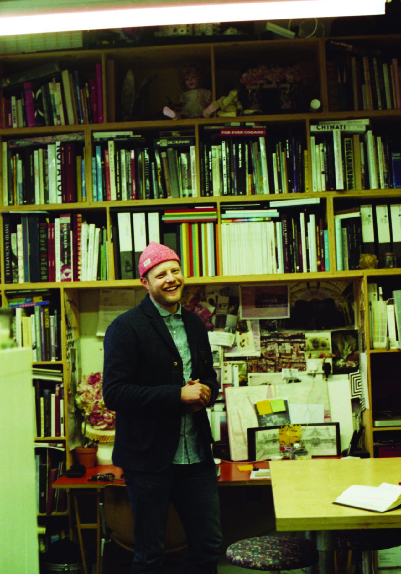
M: Let’s start with your installations at Dover Street Market. Perhaps we could start with how you came up for the concepts for installations in both stores (London and Ginza, Tokyo) and how you started to work with the company.
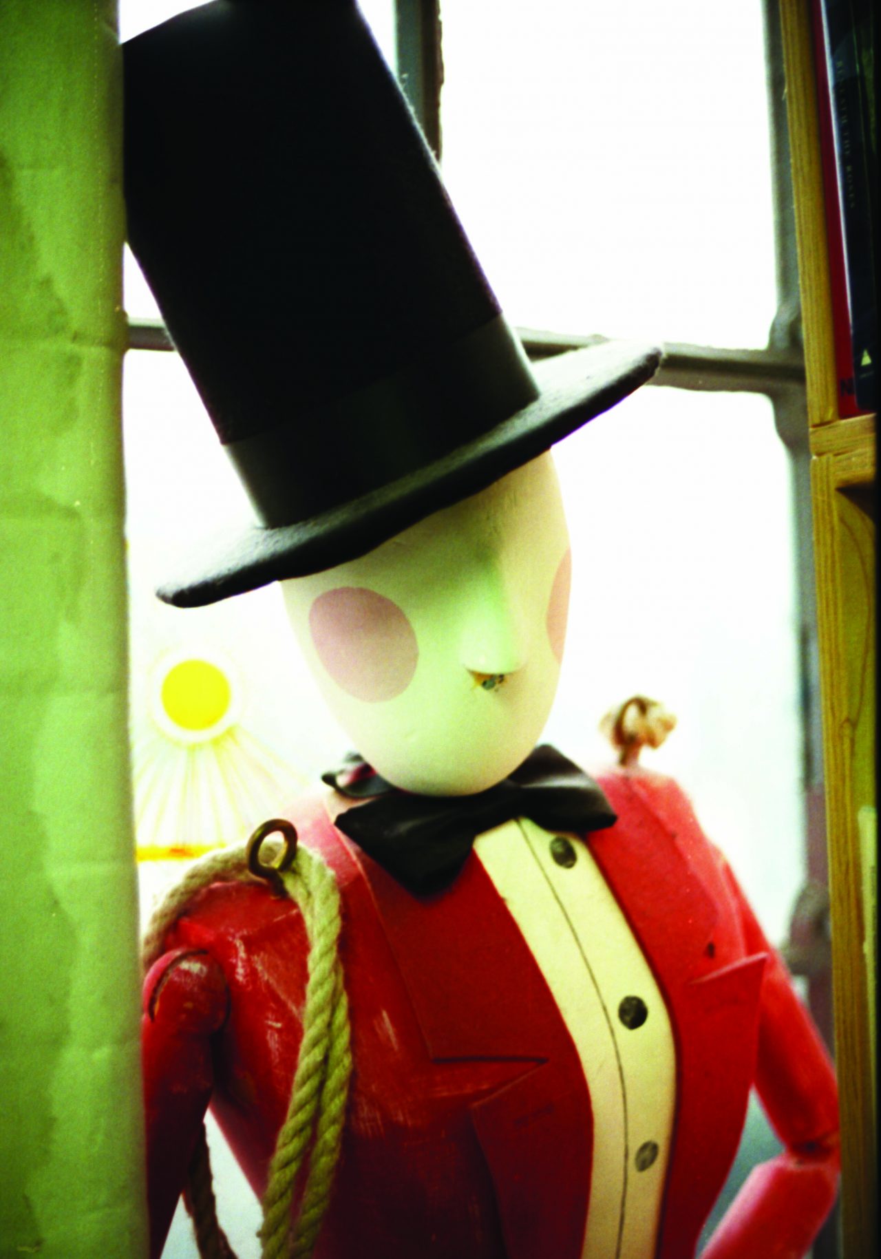
A: The first thing we did at Dover Street was for a Tim Walker book launch. For his first book, Pictures, we did an installation which was painted drum shapes which illuminated and had a kind of ringmaster doll holding the book. I mean it was very Tim at the time, and very folksy, circus-y, kind of playful and fun.
M: From there they saw your work and commissioned you for more?
A: Their team asked us if we’d like to do something else (more installations). They really liked the fact that the window illuminated their whole concept space, and because the window is always like a kind of sculptural display case. I suppose that would be the best way to kind of describe it. With the window at Dover Street, you’re quite often not really selling something so it makes you sort of re-evaluate what the window is. It’s nice to try and do something with it that gets people to stop or think – because that’s the hardest thing, isn’t it! People are so busy they’re just passing glances. The windows are slightly raised up, at waist-height, and you look into the space like you’re looking into a tank or a display case. When people do stop and take two seconds and I think that’s rewarding.
M: Their curiosity is awoken and then they come in…
A: Exactly. There are various people that go to DSM, and they always look so good, right? Then I thought about creating a window that slightly celebrated the people that went into the store and the way that they look as well. So the idea was that we created this wall and then this walkway, that kind of felt like a much bigger space, full of flowers and mirrors, this sort of loosely hyperreal colourful woodland space. I thought the idea was that the slightly braver people might go in and suddenly… they are the window! This is Dover Street and these are our customers, this is our window. I don’t know, I just thought it was quite a nice way of turning it around on itself to kind of celebrate the people that support the shop and things like that.
M: Your idea becomes a unique point for them.
A: Yeah, the store could be what it is and be quirky and interesting but it’s the people that shop there and the people that they collaborate with that kind of add the final varnish on it and make it unique. And you know, that’s what sets it apart, what sets them apart.
For me, you can always make something that’s pretty. You can always make a pretty interesting object. But what could you do that would then give something back, or how do you spin it on it’s head? I quite like the idea at that moment, how you could re-interpret the idea of a display tank or whatever. You know, like, when you think of people looking into aquariums and they’re all gathered around by the glass looking in. But how could you make it so that you’re the crowd actually in the window, and you’re the display, and you’re out on the street. Or how do you turn it all inside out to maybe make people engage with it. Without sounding rubbish, you are selling an experience, or selling a talking point.
M: How did the Giant Rose in London and Ginza come about?
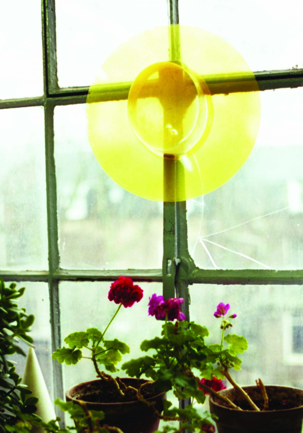
The rose was part of several suggestions that we sent to DSM. One was a Magritte picture of a room filled with giant apple or maybe there’s even a painting that is a big flouncy and romantic rose. The feedback was that Rei was intrigued by that as a picture, and I said that it would be nice to create this over-sized rose, but take that very sort of romantic, soft imagery and re-create it in a kind of high tech material. Too me that was the attraction in the sculpture.
But actually, it doesn’t look that high tech when it’s finished! It looks a bit like granny’s glass vase, glass roses… [laughing] like one of those things that you would find on a mantle piece somewhere. Just because when it has a little colour in it, it looks more like it’s glass.
Anyway there’s one of the freelancers we work with regularly, Bua. He’s really good with plastics, and he’s an architectural model maker, really. So we worked with him to make a model of the rose which was the size of a natural rose but all in acrylic, to kind of suggest that this was what the idea could be like, and this is how it could work. Originally it was only for the London store, and then we were asked to create another for Ginza. When it got there she was so thrilled with it that we had to do another one for Shanghai.
M: When you started your career, you originally began assisting Shona Heath?
A: I was studying how to make furniture at the time, and I didn’t know what set design was. I think Shona was quite influential in making it into something a bit more. I mean there’s Frame this month, and a whole article about young set designers creating props and sculptural elements and craft ideas for shoots.
Sometime installations get labelled as set design but I’m not really sure if it’s set design but more..
M: Like visual display…
A: Yeah, it’s kind of like visual merchandising in sculpture, I suppose. But then it kind of becomes something…
Originally the set designer’s were people designing stages, theatres and spaces that films, theatres and television operated in and I think the stills side of it was always a little bit behind that. So I think it’s now down to people like Shona, Simon Costin and Michael Howells who have been very influential in our work in stills but I think it was Shona who really made it become an area within itself. And now there’s a lot of people that do set design that it’s become a bit of a bi-word for slightly arts and crafty installations and things.
In the fashion side of it, because it’s a photograph with a single view point for that image, you don’t have to create a cavonus space for someone to move in, or worry about what’s going on behind that wall, as you specifically set the camera to capture what you want to show. So you can make everything, you construct everything to work with that view point. The same with shop windows: you show the viewer what you want them to see. So I think the thing is that, it has just evolved to have these kinds of elements of theatre and sculpture within it.
M: Tell me a bit more about the Andy Hillman Studio and team behind it:
A: There are four people, including myself that are full timers and another six people who are really regular freelancers. It depends on the project, the hardcore construction stuff we sub-contract out to build companies.
M: Does everyone have their own skill set and is that how they contribute to the team or everyone pitches in with…?
A: Oh, yes! Yeah, there is a bit of that. Everyone’s got a sort of specialist area, similar to Mission Impossible… but then, also everyone is a little bit a jack of all trades too.
M: Do you think that’s needed for this role?
A: I do think it’s helpful because there’s always so much different stuff that you can end up doing. Sometimes you need to be holding a paintbrush or glue gun or other times you might have to rudimentarily sort of sew something together on set… or do receipts….
In the team it’s a slow change around, so we don’t often have new people joining the team as it were. Which is quite a hard thing to explain to people when they write in. They can be amazing, but it’s more about if they fit in the team. I always used to find that really hard to understand when I was applying for jobs when I first left college. I was like, “there’s all these companies and, you know there must be loads of jobs and positions and stuff” and then you realise actually, companies are really small, even though you might see their name around in the press. Design companies, artists, things like that, are usually small. Even if it’s got a big name, it can still be a very small company and therefore the kind of changeover of people is really small. It’s very much about right place, right time. There’s no reason why anyone is necessarily any better than anyone else, they just happen to have come along at the right time, when you need some help.
M: And the same is when you’re drawn to the photographers you work with, because guess that happens organically and one projects leads to another, such as Tim Walker.
A: Yeah, opportunities tend to present themselves to work with people and then, it either works or it doesn’t really. You either get along or you don’t get along. I tend to find that so far, we’ve got a nice balance of the photographers that we’ve worked with, in the sense that, there’s a nice difference between Tim (Walker), between Peter Lindbergh, between Craig (McDean). They’ve all very much got a style, which is really nice. And they’re very different and I think that’s great. It challenges you to move between the different areas and different worlds, which is rewarding because they all have their own approaches, and their own way of doing things, and I think that keeps it quite fresh.
M: Will you be doing some costume design as well?
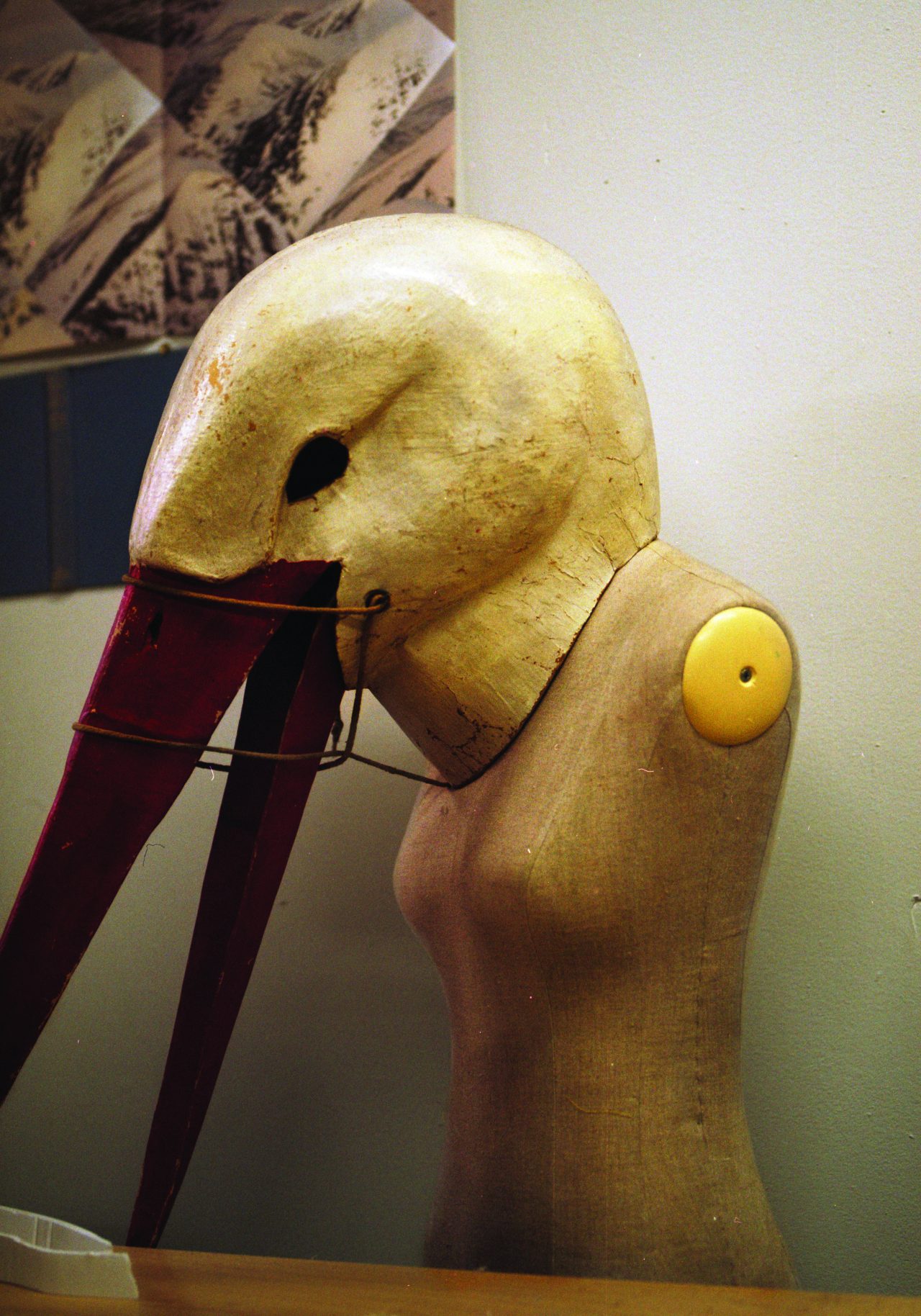
A: We’ve made costume props-masks and headgear for shoots, but it’s not something that we specifically do. Things can be styled up to be very theatrical, make believe but it really depends on what the project is. There’s Hannah and Penny in my team, who are amazing. Hannah’s an amazing seamstress and her and Penny made all the clothes for the big doll (used in the Tim Walker shoot). Also, it’d be interesting to make something slightly different and work with filmmakers, writers or illustrators.
M: Do you come up with different concepts for each project, and what do you use for your visual references?
A: Here in the studio there are things that get stuck on the wall, collected in boxes, a sketchbook folder on the computer…
Nowadays, there are so many different ways you can collect or come across ideas, there isn’t really one way.
It’s kind of collecting, keeping hold of, hoarding everything from images, objects, materials and bits and pieces, things that jog your imagination and sometimes you keep stuff and you don’t even know why you want it! for instance when you’re reading a magazine or a book and it makes you write something down, you tear that out and you keep it. It might not come to anything or it might a year down the line become the basis for a window at DSM for example.
M: Eyes always open…
A: A while ago somebody asked me,“do you think life is stranger than fiction?” and I think yeah, definitely. I think just having your eyes open is good, not being too judgemental. Otherwise you kind of limit your options.
M: And lastly, what is the most memorable editorial you have worked on?
A: A really enjoyable one was the one with Tim Walker where we had the giant doll. And the first shoot we ever did with Craig (McDean) where we had these inflatable bubbles and structures, was actually really, really good fun. Also recently just before Christmas, we were invited to South Africa for a job which was an incredible experience.
Andy Hillman was featured in Ala Champ Issue 8 ‘2014’
Photography: Nicolo Terraneo for Ala Champ
Text & Interview: Monique Kawecki
With Thanks: Jennifer Kulas


